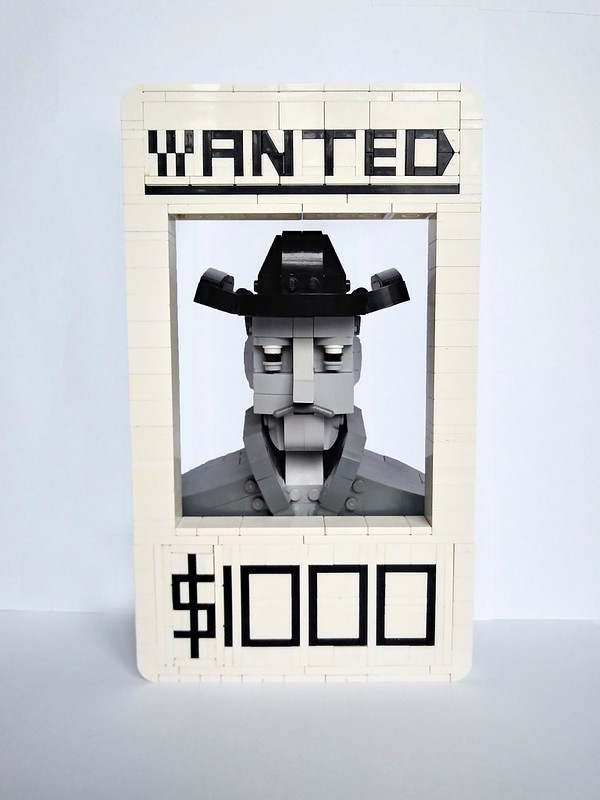
One could argue that this LEGO creation by balticlegomoc is of a guy who wants $1000 presumably for a festive makeover. But that’s not how wanted posters work there, pardner! Wanted posters alert the public that a bounty is out on some steely-eyed outlaw or another for the crimes of extreme vagrancy or something. From a graphic design standpoint, there are two different brick-built fonts here neatly centered, which can be hard to pull off in LEGO.The use of grayscale give this an old-timey feel. I like that this particular steely-eyed outlaw is a brick-built bust with a literal handlebar mustache.
Tag Archives: Fonts
Will Luxo Jr. ever be held responsible for its malicious letter smashing?
Paulville MOCs is no stranger to our pages, racking up almost as many hit creations as the Emeryville, CA-based animation studio Pixar. This little scene perfectly captures the multi-jointed lamp Luxo Jr and the distinctive company font with long serifs formed by partial clip connections and bit of flex tube.
Wondering what the letter “I” looked like before it got squashed by that devious lamp? Paulville’s got you covered.
The prominent minifigure torso in the lamp is the latest Iron Forge seed part being used by builders the world over in the latest free for all round. Our own Ben Stenlund recently used some to great effect as birdhouses.
A fancy title is all you need
Excited for The LEGO Ninjago Movie? The movie trailer has been out since February, and we got our first official look at some of the sets last month. But whether or not you’re going to take a pass on the film or are already in line (6 months early), you can surely appreciate this awesome fan design of a brick-built scroll of the movie’s title by ZiO Chao. The lettering is perfect, both for the small text in Latin characters on the top and bottom and the main title with hànzì characters.
When typography is on point, bricks become words
Jonas Kramm, whose way of seeing LEGO bricks has delighted us so many times, has simply done it. And by that I mean he’s literary created “it” with a handful of bricks and curved slopes. This is a fine example of an antique neoclassical font… heavy lines with sharp ends and gorgeous serifs.
If you like this creation by Jonas as much as we do, check out his other builds for “The New Black” project on our favorite parts-obsessed blog New Elementary, where Jonas explores the unlimited possibilities of modified and unusual parts, like paint rollers which he used to create some stunning antique street lamps.


