
Hey. You’re reading a series of posts where we’re looking at a LEGO model as a message, not just as a pretty sculpture. I’d recommend reading the introduction and the first two parts before diving into this one. It’s kind of important. An apology to all of you who comment – due to a busy real life I seem to be late at responding to you. I do read all of your comments and take them to heart though – look forward to a nice highlighting and summary in the last part of the series.
In the previous two installments we began thinking about 1. What to build, and 2. For whom to build. We concluded that these things are really important – those two factors control how we go about designing our model. Today I promised to finally open our toolbox and discuss the design and build.
Oh? Is it true? After two weeks it’s finally time to learn all of the nifty techniques and secret part combinations to making a model instantly awesome? Right?
Yes and no. Today we’ll do two things:
- Pin down how to convey our message (Design)
- A case study on technique usage (Build)
There are many ways to design your message, and honestly: for all the focus there is on the technical side of building, parts and techniques are fairly unimportant on the whole. I want to get you thinking about why you might want to use a certain technique, beside it being cool at the moment. That’s why we’ll focus on how to further refine our message, and only do a case study of a model with interesting parts usage. Don’t fret though – in addition to that, I will do one case study every other day until next Monday.
Think of it as a win-win situation: I get to show you when to think about techniques, and you will get to see four different situations that required special skill with the brick. Not bad.
Conveying our message
When trying to pin down how to get our message across, I’d argue that two factors are more important than others: our use of shape and colour. Combined, these two elements will create the foundation of how a model will affect the audience. Shape and colour is for LEGO building what layout and typography is for graphic design, or disposition and style is for writing – it is what leads your audience through your message. It is what makes your model talk. The rest is just icing on the cake.
Yet, interestingly enough and unlike the previously mentioned occupations, we often focus on everything else when viewing a model and only notice these two factors when they are glaringly flawed.
Different colours bring different associations. Black is dark, and oftentimes associated to an abstract evil feeling. Green can be natural, blue can be watery. Bright and scattered colours give models a lighter, less serious tone, whereas controlled, subtle hues tend to lean towards the sterile, corporate and serious look.
Same goes for shapes. Bulging, wavy, irregular patterns tend to give a more organic feel; controlled geometrical patterns are often associated with the industrial and man-made.
My fellow brother Nannan is an expert at playing with some of these contrasts.
If you’ve followed the Brothers Brick you’re no stranger to his Black Fantasy genre. It has exploded in popularity. Many try to take a stab at building the horrid biomechanical creatures he conjures up, but few succeed. It’s hard to pull of a well-constructed Black Fantasy piece. I know, I’ve tried and failed.
Have a look at Nannan’s Charon.
Pitch black as lurking darkness, with evil in its orange eye. Bulging tentacles erupt from the geometrical frame. Scary. Freaky. Utterly brilliant in its shape and (lack of) colour.
But imagine that the Charon wasn’t black. Justin Vaughn, aka Mainman, tried something similar in brown.

A very well built model. Equally organic bulging shapes on a geometrically controlled base. But it’s brown, and not even half as evil as Nannan’s black creation. We enjoy it as a playful take on Black Fantasy, but if we had no knowledge of the overlying theme it would’ve been pretty bland. Maybe we would think it was some kind of space ant.
That’s how easily colour can make or break a concept.
If we want to see different shapes in action we can turn to another of Nannan’s works, the surrealist vignette Cry of Dreams:
Here he lets the organic bulging shapes contrast with the large sterile square blocks. By letting two extremes clash like this both characteristics are enhanced, and the (almost) monochrome setting gives it a dark undertone. Had this scene been placed on circular platforms, or even cloud-shaped ones, we would’ve perceived it quite differently.
Today we have a powerful tool to pre-visualise different colours and shapes on a model. It’s not a bad idea to do like Dennis or Jehkay and use the computer to try new colours and shapes out before actually building them.
Case study #1: techniques should come last
So, if we had been planning and building a model according to this series, here’s what we would’ve done up ’till know:
- Determined what we want to build. (Our message.)
- Decided who we are going to build for. (Our audience.)
- Thought of colours and shapes that best convey 1. for 2. (The design.)
Now is the time to think of techniques – to do the actual build. Do you see how late in the process this part comes in? LEGO pieces and their combinations are merely ways to realize your underlying concept.
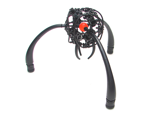
Let’s analyze my old friend Ossscar the Serpent. Built three years ago, he is shock-full of parts used in a non-traditional way. What went through my head when I built him? How did I choose the specific parts? Drugs?

Here’s my train of thought, step by step:
- Up to that point, I had never built something that was supposed to be organic and wanted to take a stab at it. I chose to build a snake-like creature because, frankly, it seemed to be the easiest thing to do. An easy shape to realize in LEGO, and referencing an animal most of my audience knew meant I had greater artistic freedom.
- At the time I built for a very specific audience. I had just happened upon the Classic-Space crowd and really wanted to impress them. Secondarily I built for myself, my girlfriend and the people who came to visit our home – LEGO models make great conversation.
- Building something snake-like meant that I had a general shape to follow (long and bendy with head on front). I chose to mainly use the colour green, to further play on the snake/lizard association. Building organic meant trying to steer away from the blocky look.
- That meant I had to look for pieces that could convey the shape I was looking for outside the traditional elements. With my limited selection of green pieces, I was drawn towards my box of plants and some Bionicle sets I had picked up. With the pieces in front of me and some jolly experimentation the scaly body was quickly conjured up, as well as the unusual Kraata-jaw.

The rest was just about fleshing out the details. Concept first, technique last.
Next time: getting your model to your audience. It’s time to talk about presentation.


