At first glance, it appears that Keith Goldman has been joined by Edward Estlin Cummings for the 14th installment in our series of interviews. If all-caps is yelling, Deborah Higdon whispers her answers to Keith’s questions. Thankfully, Deborah’s answers are worth the extra effort to hear. Without further commentary on capitalization from me, take it away, Keith!
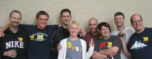
 They say that our hobby is dominated by mannkinder, and the closest we come to the feminine touch are our beloved bevy of gay men and the unfortunate epidemic of man-boobs. Our community meetings and events are virtual sausage festivals, with only the occasional long-suffering wife or girlfriend to break up the monotony. Even my own beloved interview series has been as they say in the armed forces “a mile of %&#@”, and with that in mind I sought out not only a great builder…but a real live woman. Many of you are familiar with Deborah Higdon for her outstanding architectural models, minifig scale furniture, and hatred for capital letters.
I sat down with Deborah at the Palladium where the Ottowa Senators were tied going into overtime in round one of the NHL playoffs. We talked about how the O-Train got its name, high-sticking and how to assemble a Frojista from Ikea without an allen wrench.
The Build
Keith Goldman: In your Flickr profile you mention that you’re a frustrated architect at heart, a condition that is not unique in our hobby, how does that influence your subject matter or building in general?
Deborah Higdon: oooh, we’re starting off with a serious question. ;-) considering i mostly choose to moc buildings, i’d say the influence is pretty strong. strangely, i admire historic architecture most, probably equally for the craftsmanship that went into the details as well as the design of the building itself. i say strangely because i don’t tend to build historic styles. when admiring architecture, i prefer historic. when designing a complete house, i prefer modern, and not just because i find lego lends itself more “easily” to modern styles, it’s not about “easy”. modern building allows more leeway for an active imagination. on rare occasions, i think it’s fortunate i didn’t become an architect – i don’t think i could put up with the physical limitations of engineering (what do you mean i can’t have a waterfall flowing between the 2nd and 3rd floor, falling out of the wall to the sea below?) i’m not sure that i’d have been all that good at satisfying the client 100%. compromising something based on æsthetics would be very difficult for me. the influence also comes from the design blogs i’m addicted to. i’m trying to quit, looking for a blogs anonymous group, know any? the first step is admitting the problem.
KG: You’ve built extensively in both minifig and microscale. What do you like and dislike about each scale and would you ever consider mixing the two?

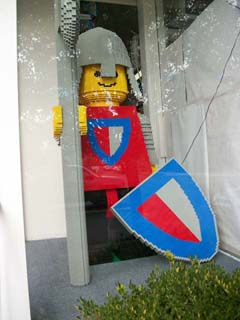
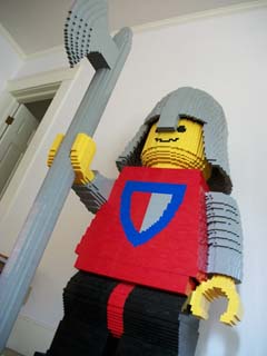
DH: i don’t think there’s anything i dislike about any scale. i might dislike the infamous proportions of the minifig, (i tell myself, it’s just a toy) but as all my afol friends know, i’m not fond of the minifig itself in my mocs, (blasphemous talk, i know. i know how tbb originated, sorry andrew!) so no problems for me. but all the houses and furnishings that i build are built with the minifig in mind. microscale building is my spouse’s favourite – it costs less, takes up less space to store and less time to build – he wins in all ways. as for what i do like about these scales, i like replicating. i think of the miniatures i used to collect. i looked for high quality representations of handicraft (shaker furniture, farm tools) but i never wanted a doll house for them, and certainly never the dolls to go with them. i see the houses that i build more as architectural models that happen to be in minifig scale. i’ve seen others mix the scales with great execution, but i’m not tempted yet.
KG: On both Flickr and Facebook you quote Einstein on curiosity:
The important thing is not to stop questioning. curiosity has its own reason for existing. one cannot help but be in awe when (one) contemplates the mysteries of eternity, of life, of the marvelous structure of reality. it is enough if one tries merely to comprehend a little of this mystery every day. never lose a holy curiosity.
What role does curiosity play in your building and what do you think about most often when you build? World conquest? Work? Freddie Mercury? The mysteries of the universe?”
DH: curiosity is huge for me, bane of my mother and father’s existence i was. i’m always looking at buildings, doors, windows, stairs, furniture and design elements and asking how can i make that in lego, what pieces can i use? can i make it on a smaller scale? can i make it look realistic. how can i make it stronger, can i get it to a fest? can i think of a new use for this piece? needless to say, i talk to myself a lot. thinking you ask? i think about dessert, martinis, new shoes, what makes people tick, what makes people not tick, what makes clocks tick. oh, sorry, i digress. you mean when i’m building. hmm, i think about chocolate, dark chocolate, which leads to dark chocolate bricks, and then leads to me lamenting that lego doesn’t make cream bricks, then the lack of earth colours in the palette comes to mind then i forget what i was going to build.
 i certainly don’t think of world conquest, i’m canadian, we don’t have that gene in our makeup. i never think about work, never, not while in the building zone. who’s freddy mercury? never mind, i can google him. sometimes the mysteries of the universe cross my mind.
More of Keith’s interview with Deborah after the jump: Continue reading →
The Brothers Brick is funded by our readers and the community. Articles may include affiliate links, and when you purchase products from those links, TBB may earn a commission that helps support the site.


 “This is going to make me sound really weird but when I was in Milan I had such a big amount of spare time. I found online that you can buy a Lego model of the