There’s just something extra classy about an old manual typewriter. Maybe it’s the retro styling, or the mechanical aspects, or maybe it’s just pure nostalgia. Whatever the case, the latest LEGO Ideas set (#35 in the series) offers fans a way to add a swanky 1:1 replica to their collection. The 2079 piece 21327 Typewriter will be available June 16th for VIP members, with general availability starting July 1st from the LEGO Shop Online for US $199.99 | CAN $269.99 | UK £179.99. But can a LEGO version be as cool as an actual vintage collectible? And what if you don’t care about typewriters at all? Is there anything here to tempt you? Well, don’t write it off just yet. Come along as we take a close look at this upcoming set!

The LEGO Group provided The Brothers Brick with an early copy of this set for review. Providing TBB with products for review guarantees neither coverage nor positive reviews.
The box and contents
Let me start off by saying that if you’re interested in manual typewriters, there’s a giant rabbit hole of information out there. I’m not going to delve too much into that area during this review, although there is a bit of real world comparison at the end for the curious. For now, tempting as that trivia is, let’s focus on the LEGO!
There are times when the stark black backgrounds of LEGO’s 18+ line theming seems a bit drastic, but this is one set where it really looks quite elegant. The LEGO Ideas branding is very subtle, appearing just under the “Typewriter” logo. If you were a fan of the initial Ideas Submission, the first thing you might notice is a drastic change in the color scheme. Instead of the original classic black look, we get a delicious outer casing in the rare sand green color.

The back of the box offers another angle on the typewriter, a brief description of the LEGO Ideas process on the right, and a “Special Letter from Thomas Kirk Kristiansen Included” blurb on the lower right. (You can see the letter in question to the upper left in the main photo.) There’s also an insert shot showing a top-down view of the typewriter and calling out the dimensions. (10.5″x10.5″ / 26x27cm) A final picture in the lower left shows the action feature of the set – a blurred hand is seen pressing keys, moving the carriage along.

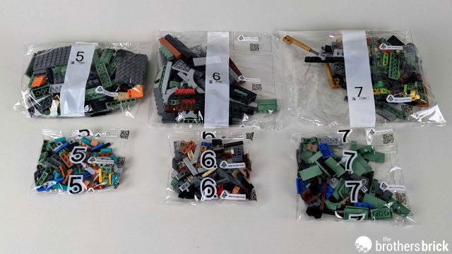
Inside the tab-sealed box are 17 numbered parts bag and an unnumbered one containing some larger pieces.


A white cardstock envelope protects the paper goods from damage in transit. It’s always nice to see LEGO taking this extra step to ensure things arrive in great shape, particularly in these more high-price / high-profile offerings.

Inside the envelope are the 260 page, perfect-bound instruction manual, a 44-page booklet of letters, and a sticker sheet.

The parts
The sticker sheet for this set is printed on silver foil, giving a great illusion of polished metal for the labels. As revealed by the set designers, the ID numbers on the larger tag are full of Easter eggs. The “SG” stands for “Steve Guinness”, the creator of the set. “NGUOYD” is for the positive affirmation “Never Give Up On Your Dreams”, and 03-07-74 is Steve’s birthday. Billund, Denmark is, of course, is the home of LEGO.

This set comes with some new and rare recolors to existing parts. Of note are dark grey Technic panels (first seen in 2021 Technic sets), and 1×1 bricks in nougat (first seen in 71741 Ninjago City Gardens). The sand green 1×1 bricks with Technic axle holes are a new color for this set, and the back versions were previously only seen in the Creator Expert 10283 NASA Space Shuttle.


Another new color for this set is the red Technic liftarm (Modified Fork 2 x 2 with Axle Holes), previously only available in black and white. The real stars of the show, though are a full alphabet’s worth of printed 2×2 tiles, two 3×3 round printed Shift Key tiles, and one 3×3 round Shift Lock tile.


There are even more cool parts to talk about, including a custom cloth ribbon and 5 medium nougat 1×5 plates. And a ton of sand green goodness. I’ve saved all those to bring up as we move through the build.
…Oh, okay. Let’s reveal one exceptional new sand green part right now – these mirrored 2×10 curved slopes, previously only available in white in the 10295 Porsche 911. But, seriously, there’s a lot of sand green on the way.

The manual
Before we move on to construction, let’s take a moment to appreciate the instruction manual. Like most recent Adult Themed sets, it starts out with several pages talking about the set’s context, origins, and creators. These pages have a black background, while the instruction sections have a light grey tone.
The first page of the booklet has Thomas Kirk Kristiansen, chairman of the LEGO group, talking about using the theme of this set as a way to send a special message to “dedicated LEGO fans” by way of the included letter. The next pages give a brief history of the typewriter and how it has been used through the years.

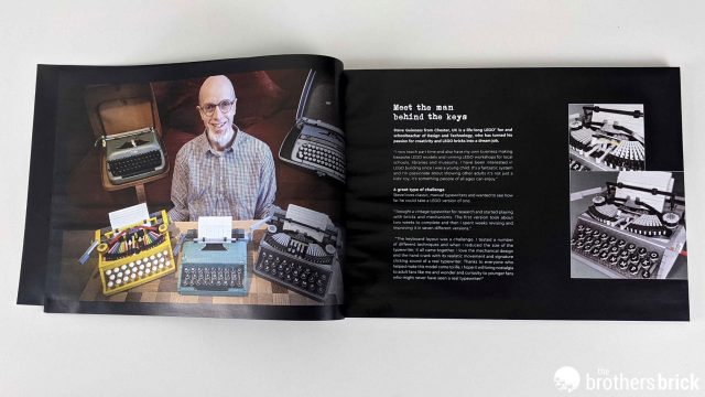
On page six we meet the man responsible for this set, Steve Guinness. He’s a school teacher of Design and Technology, and also runs LEGO workshops for local schools, libraries, and museums. He’s shown with several iterations of his typewriter design, and he talks a little about the process he used to get his Ideas creation constructed.
The last stop before the building starts is a brief interview with the three key LEGO designers involved with the project: James May (LEGO Model Designer), Wes Talbott (LEGO Design Master), and Martin Fink (LEGO Graphic Designer). I’m a big font-junky, so I’m glad they included at least some high-level thoughts from Martin on the choices made for the keys and logos.

The build is broken up into eleven stages, spanning three major “chunks”. The first is putting the keyboard together, the second handles the mechanics of the carriage and striker, and the last adds the platen and other finishing touches.

The build
As you might guess, things start off with a huge pile of Technic elements. Just about everything colorful shown here will be hidden in the final build, but those colors will come in handy to help keep things organized during construction.

The majority of the parts above are used to make rods in three different lengths. You’re instructed to make nine copies of each of these designs.


In most LEGO instructions, I’ve found that if you’re building something multiple times, the next step has you combine all of those parts into a larger model all at once. That may help explain the confusion I had when I saw these intricate combinations of parts that didn’t seem to have any means to assemble correctly.


Of course, I was just being stupid. The above illustrations just show the parts in a big pile for later use. As you can see, I didn’t try very hard to match the pile “design”, but I did think about it. But sometimes a snarky photo just isn’t worth the time.


Stage 1 finishes off by making these five additional levers. Once again, I was glad to see some color coding to help keep things organized while things were still in “pile of parts” land.

Since after-market builders are going to be very happy to see the broad range of parts in sand green, I’ve broken them out for each stage. Here’s the selection of elements from stage 2. Of particular note are the 32L Technic Axels (first seen in the Botanical sets)

The keyboard mechanism is basically a huge stack of the rods built in stage 1. The instructions here are very clear, if somewhat repetitive. Still, it’s a bit of a challenge to try and make sure you don’t accidentally get something out of alignment.


With a few of the rods in place, you can start to see how the three rows of keys are taking shape. Things are locked into place pretty well, but there’s still a little bit of play until most of this section is done. There’s no guidance as to how tightly things should be tensioned together, and I know I didn’t find the optimal spacing every time.


Anyway, eventually all of the bars will be in place, with a sturdy frame of sand green brick and plate keeping things more or less aligned.

From the front, you can see where all the keys will go. I’d suggest spending a little extra time at this point to make sure each lift arm can move easily, and trying to jiggle the adjustment a little if things feel too tight.

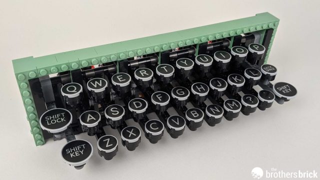
Stage 3 was a special treat for me – putting on all the key caps. All them have the same basic construction – two 2×2 round plates, a blue Technic pin, and a round printed tile.

My only complaint here is that while the blue pins do provide a level of friction, the keys can still rotate freely. It was probably not feasible to get a design that put a Technic cross-axle connection at the end to keep things locked in without seriously upping the part cost. Since this is really meant to be a display piece it’s not a big deal, but the more detail oriented among you may be a bit annoyed that some of my keys aren’t quite straight in later photos.
Stage 4 completes the keyboard build. There’s another giant pile of sand green goodness on offer, too. Some parts are very hard to come by, like the 1×3 and 1x3x2 bow bricks. The 1×10 plate is also scarce, having only appeared in two other sets to date.

This stage also adds on the space bar. Unlike the other keys, it doesn’t connect up with the action features of the set, but rather just has a small amount of “bounce” if you press on it.

The sides of the keyboard housing are locked in place with Technic pins, and are reasonably sturdy. You can also see that there’s no “bottom” to the keyboard area; you can see straight through to the table top below. This matches the design of actual manual typewriters. (And quite a boon compared to the crumb-catcher “feature” that we have to deal with in modern keyboards.)

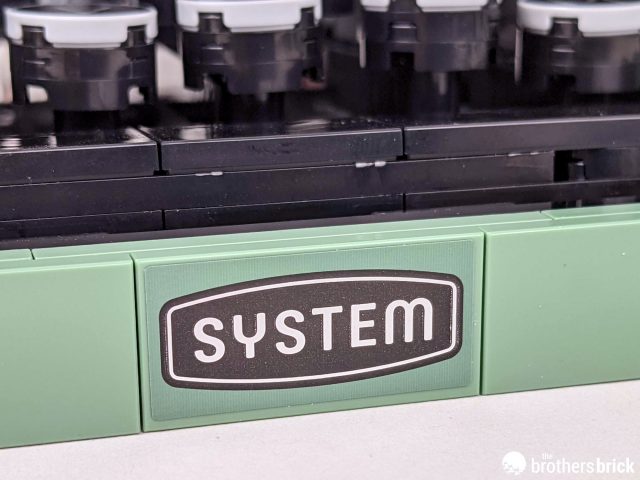
The front bottom edge of the keyboard tray gets the first sticker, the “System” logo. The shiny foil sticker really does add to the appearance over a matte finish.
At the end of the first four stages, we have a very nice, compact keyboard build. The lack of a number row is a reasonable trade off for space concerns (and some very early models didn’t have numbers…or even lacked the number 1) and some might be confused by the lack of an “enter” key. Remember, this is a manual typewriter, and the carriage return functions were handled, well, manually.

Stage 5 beings the construction of the main body of the typewriter, and means another batch of sand green elements to peruse.

This stage is a nice breather between the more Technic-heavy steps. Things go together quickly, adding a nice bit of heft and stability to the base.

Soon enough, though, we’re back to the more complex and fascinating parts of the build. These constructions are hinges that will hook up to the grey Technic panels we showcased earlier.

When assembled, the panels rest over the key’s lift arms. You can see some of the rods on the sides (the ones attached to the Shift and Caps Lock keys) don’t interact with the panel – appropriate as they shouldn’t invoke the typing action.

No matter which of the letter keys you press, the panel assembly will be pushed forward. This is where you can really start to see some of the problems I had with tensioning. When I press the “N” key, you can see the “U” key also moves.

Stage 6 doesn’t have quite the range of sand green elements, but does have those nougat 1x1s, and a very neat new treat – a 1×5 plate in medium nougat! There are also bar clips in metallic silver, a new color for that part.

The floor of the typewriter is fairly straightforward, with a few Technic connection points and a lot of interlocking plate and tile.

The next bit of gearing is the assembly that will allow the typebar to move when a key is pressed. Essentially, it’s just a pivot that will be pushed forward when the panels move.

In place, you can see the moving typebar will be dead center in the assembly. A more complex build with multiple moving typebars was part of the original Ideas submission, but honestly this is impressive enough on its own.

Here’s a shot of the mechanism in action. As you can see, the “return action” on the key is very gravity driven, which gives it a fair bit of lag between possible keypresses.

Stage 7 finishes up the back edge of the typewriter, and sets up the base the carriage will rest on. We see a return to a wide array of sand green elements, as well as some rare Technic connector colors.

There’s a bright burst of color in the ratcheting assembly. This block of gears will handle the motion of the carriage, moving it incrementally to the left with each keypress.

The key stop-and-go functionality comes from the rotation’s interaction with this saw blade element.

It’s a little tricky assembling this section, and depending on how much you fiddled with the keys you might have to play with the Technic rods a bit to get them to click into place.


At the end of stage 7, though, you can do some play testing to make sure things are moving as expected. At this point you’ll also be thrilled by the “authentic typewriter sounds” that pressing the keys generate, as well as the satisfying ratchet sound when you push the carriage back.

Stage 8 finishes out the base, and has the biggest range of sand green goodness yet. This step also uses those new sloped curves I highlighted early on.

Interesting details at this stage are a small (non-functional) switch on the left that indicated the red/black setting for the typewriter ribbon, and that lovely curve front and center. By building “studs sideways” for the case, you get to see mostly the sides of the brick, making for a super clean, smooth finish. This works perfectly, and “reads” much better than if LEGO had opted to leave a bunch of studs exposed everywhere. As it s, there are just a few to remind you of the construction medium. Perfectly in balance, as all things should be.


Stage 9 also has some sand green parts, but only three kinds: 1×4 plate, 1×4 tile, and 2×4 tile. Please refer to the Stage 8 photo if you want to look upon them again. The construction here is all about the base that will hold the platen. The second sticker gets applied at this point, giving you something to read if you’re looking at the typewriter from the back.


Stage 10 puts the platen in place. (We’ll talk more about its functionality in a bit.) There are three more sand green elements, and you can see them all in paper guide at the rear: left and right 1×2 corner wedge tiles, and a bunch of 2×2 sloped tiles.

The final stage in the kit, stage 11, finishes off the build with the print ribbon and remaining typebars. The ribbon is a brand new element, and you also get an array of silver ink tiles, more silver bar clips, and a 2×2 grooved brick in “new for 2021” dark orange.

The typebars all have the same basic design, and attach onto a bit of flex tubing behind the type guide. The flex tube is difficult to get the right bend on, and the typebars are a little tricky to space out evenly. This is another level of “perfectionist detailing” that won’t bother most people, so don’t sweat it too much.


Next up are the ribbon spools. The cloth ribbon attaches to the end of some Mixel ball joints, and is encased in a good looking black cylinder.

Once you have the spools assembled, you slot the ribbon into place behind the key guard. The illusion that this is a working manual typewriter is almost flawless at this point.

The final bit of build is the carriage return bar. It’s built from light grey brick with an upper edge of inked silver elements. It’s mounted on a click-hinge joint which seems to support the weight just fine. The only concern is that it’s too fragile to push the carriage from the end of the lever – you have to press right by the hinge to keep things from breaking. LEGO does call this out in the instructions, although I think most people will accidentally pop the bar off more than once. (Particularly when this gets shown to friends who haven’t read the manual.)

From the back, you can see how well all the components fit together. There’s just enough “machinery” exposed to give things a high level of realism. The exposed studs on the moving typebar make it look functional, even if you’d only ever be able to type “OoOoOoOoO”.

The finished model
The completed model is an amazing example of what can be created with LEGO brick. The sand green color is a lovely look, and the mechanical aspects of the typewriter all read “true” to me. I particularly like the little touches like the dual-color ribbon (and associated control switch), the great retro-50’s font on the keys, and the inked silver tile highlights.

There really isn’t an unflattering angle for this set. As noted earlier, the building techniques on the case mean that there are plenty of nice, clean lines to enjoy, with just a bare minimum of exposed studs pointing out that you’re looking at a LEGO creation.


Even from the rear things look great, greatly increasing the display options. Although clearly designed to be sat on a shelf, the working “type action” also makes this a curio that you’ll want to interact with.


Take a letter
The box and instructions both make a big deal about the included letter from Thomas Kirk Kristiansen. And, honestly, it’s a pretty nice message and a fun idea. The execution, however, could have been better. The letter is printed with a perforated top edge, meaning you need to rip it out of the included booklet to display it. As a result, the top edge of the paper is going to be unavoidably rough and probably pretty wrinkled from the act of tearing it free.

This small problem could have easily been solved by just printing the letter “upside down” so that the jagged edge was on the bottom of the sheet rather than the top. That edge isn’t really visible when displaying the letter, so it would have become a non-issue. Oh well, can’t win them all.

If you’d prefer to share the letter in a language other than English, LEGO has you covered. There’s a whopping 43 different versions of the letter included, ranging from Arabic to Ukrainian.


Inserted into the typewriter, the A-5 letter paper is nicely to scale. Long term, I think I’d rather have my own typewritten message on display, but I’ll probably leave this letter in place for a while anyway.


Oh, and now that we have the letter out and in place, I can finally show off the working roller! This makes putting the letter in place a whole lot easier. And it’s another cool action feature that makes this LEGO typewriter even closer to the real thing.

Comparison with a similar vintage typewriter
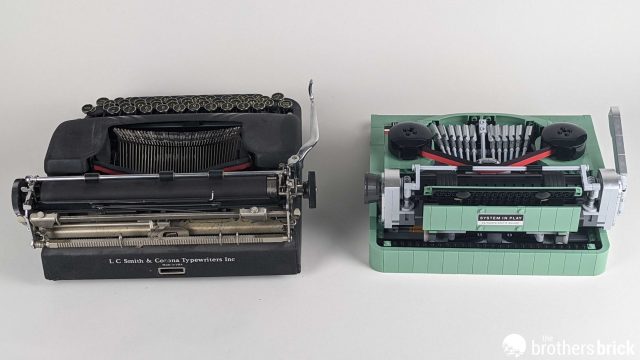
Speaking of “the real thing”, how about a side-by-side comparison with an actual vintage manual typewriter? I was lucky enough to have local friends who collect them, and was able to sneakily borrow one that most closely matched the design of the LEGO version.

As you can see, the LEGO version has a much more compact keyboard that lacks the number row. But the open-base design matches up, as does the look of the carriage return arm and typebar configuration.

From the side, you can see the roller construction is also very similar, as is the basic shaping of the lower half of the case.

Finally, from the back we can see why LEGO went with the “System in Play” sticker placement- it matches up with common machine labeling practices. While the LEGO typewriter is clearly its own unique design, there’s no denying that they also held true to all the key elements that define what a manual typewriter looks like.
Conclusion and recommendation
When it comes to LEGO Ideas and “real world objects recreated in LEGO for display”, things have been kind of hit or miss. As we discussed in our review of the 21323 Grand Piano, sometimes you have to ask yourself if a set is something you want to make room for in your life. For the 21327 Typewriter, though, the I think the answer is clearly a caps locked “OMG YES”. This is a perfectly scaled replica that will fit in with both real-world typewriter collections as well as a stand-alone piece for people who just yearn for a time when Clippy wasn’t even a concept yet. At $200 for 2079 pieces, the price-per-part comes in just under ten cents, which seems reasonable considering the wealth of rare and unusual parts. It could be better, of course, but I don’t think too many people will balk at the price point, even if they’re just interested in it as a giant sand green parts pack. I expect this set to have pretty broad appeal, at least in the folks in my “leaning to the oldster” age range. It’s a great looking set, very true to the source material, and full of clever Technic building to explore. Pick this one up if you can. It might just be your type of build.

LEGO Ideas 21327 Typewriter will be available June 16th for VIP members, with general availability starting July 1st from the LEGO Shop Online for US $199.99 | CAN $269.99 | UK £179.99. It may also be available via third-party sellers on Amazon and eBay.
The LEGO Group sent The Brothers Brick an early copy of this set for review. Providing TBB with products for review guarantees neither coverage nor positive reviews.
Check out our full gallery of images


How exactly would you have typed a letter in Arabic?
I wonder if Tom Hanks id going to add this to his typewriter collection ?
This looks amazing! Unfortunately, not being sold in the country I live in so I’m trying to see if I can get it shipped from the US. Would you be able to tell me the weight of the sealed box? Odd question I know.
If I’m reading the manifest right, when it was shipped to us from LEGO the package weight was 3.4kg. Hope that helps!