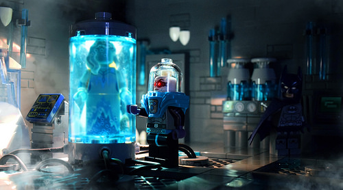
I don’t know much about the DC Superhero universe beyond the recent movies, but I do know this scene by Andrew Cookston is masterfully constructed. I love the use of the tooth plate pieces as icicles, while the placement of Batman (have you spotted him yet?) lurking in the shadows, just out of focus, is perfect. I viewed the photo a few times before I noticed him!
The presentation overall is outstanding — fantastic photography, with a wonderful focus, good lighting, and smart steam effects.

What a great build, really love the way Batman sneaks up on you.
I’m not sure there’s really a wrong interpretation of the B:TAS Mr. Freeze, largely because it’s completely impossible to make an accurate one using stock elements. To match the original character design as seen in Heart of Ice, the torso should be light-bley, the wrists/elbows/shoulders/ankles should have medium-blue bellows, and the bubble dome should have a simple collar instead of that giant shoulder armor element, and the original head from the Batman theme is the closest match to his face (both the expression and his minimalist goggles). For his redesign in The New Batman Adventures, the torso is black, the boots/gloves are medium-blue, the bellows are limited to the waist and shoulders, the dome should be trans-light blue, and the head would need red eyes with no goggles (currently there’s nothing that really matches that look).
And I heartily suggest that anyone who hasn’t seen it check out the B:TAS Heart of Ice episode that this is based on. Not only is it probably the only B:TAS episode that appears on everyone’s list of favorite episodes, but it won an Emmy (Outstanding Writing in an Animated Program), evidence suggests the animation studio that handled that episode put so much effort into that one episode that they folded soon after delivering the results, and in 22 minutes it managed to elevate one of Adam West’s Z-grade villains to A-list status so profoundly that it even managed to survive Ah-nold’s scenery-chewing take on the character.