When setting a LEGO scene, how much of a world needs to be built to spark the viewer’s imagination?
There are two approaches to bringing a world to life in LEGO: 1) meticulously build out every aspect of the scene with bricks, or 2) provide just enough detail to suggest the bigger picture while letting the viewer’s imagination fill in the rest. While building it all can make for impressive displays, I am drawn to the latter approach.
Various styles can achieve this, each with its distinct charms. Immersive scenes transport us to new worlds, like a window into a picture, by filling the frame with LEGO. Vignettes, on the other hand, embrace the artifice of a model and give the impression that a slice of the world has been captured in bricks. Even if vignettes have their appeal, I have a preference for immersive scenes. They’re more fun, if more part-intensive.
But there’s a third style worth exploring, one that many in the community – including myself – have experimented with. It’s a style that I call “Ground-Based.” As you’ve probably already guessed, this is the topic I’ll be covering today
Vignettes and Immersive Scenes
Before diving into the specifics of the Ground-Based style, I’d like to clarify the definitions of vignette and immersive scene to avoid any confusion.
A vignette typically features a clear separation between the MOC and the non-LEGO elements (such as background), often with a border, usually in black. As an example, check Pepijn’s MOC below.

An immersive scene, on the other hand, is entirely made up of Lego elements, with no non-Lego elements visible in the photo. This style is obviously best suited for photography, as it wouldn’t be practical for convention displays. Have a look at Bryckland’s MOC.

Recognizing the Ground-Based style
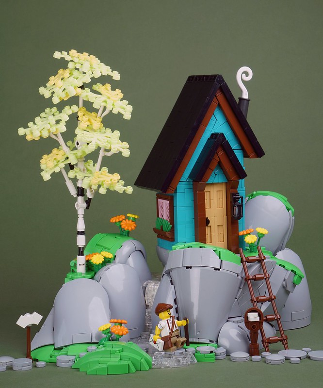
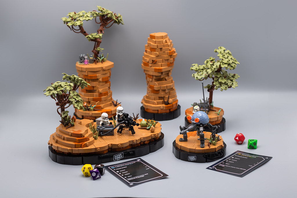
The Ground-based style is a unique approach to other building styles that aims to evoke a world or environment with minimal elements, leaving room for the viewer’s imagination to fill in the gaps.By using a few carefully chosen elements, such as rocks, plants and minifigure, the scene suggests a larger world or scene without requiring a fully built terrain.

What defines this style is that the MOC rests on a surface, like paper, wood or other, rather than a brick-built base, making the ground part of the MOC.
This is often achieved using colored paper or other materials, as it creates an interesting effect. Ground-based MOCs are usually designed with photography in mind, as they can be fragile and less practical to bring in a convention.

In the Ground-Based style, the focus is on composition and details rather than massive building. What makes a good MOC in this style is the attention to detail, thoughtful color choices, and clever composition, which work together to create a captivating scene with minimal elements.

You can see the various ways these principles can be utilized in the community-made MOCs above from Satnis, Roanoke Handybuck, Tomasz Bartoszek, and Jonah Schultz.
Ground Matters
Ground-Based style should capture a scene or a part of a world with a sense of life. Standalone builds, like single vehicles, buildings, starcraft or creature,s wouldn’t fit, as they lack the surrounding elements that help imagine the larger world. As explained above, it’s essential to have details around the main subject, the background shouldn’t be treated just as a place for the model to sit on, but more as a part of the MOC.
As examples, the amazing MOCs below, respectively built by CheeseyStudio, Leewan, Maxx Davidson, and choopyjups, wouldn’t fit the style.


“Freeform,” a cousin of the vignette with a more organic base, is closest to the Ground-Based style, as it captures a part of a world without visible borders. Nevertheless, I wouldn’t automatically consider all freeform builds as ground-based. Without surrounding elements that hint at a larger world, they often feel like isolated terrain chunks, offering little to imagine what’s beyond the edges. (Don’t get me wrong, I love freeforms!)
Finding a community-made freeform MOC that fits this style wasn’t an easy task, but AgentBrix‘s build is a great example of freeform that seamlessly aligns with the Ground-Based style.

In contrast, llego_pig‘s wonderful Hobbit Hole MOC wouldn’t fit the Ground-Based style for the reasons mentioned earlier.

Also, I would like to talk about a style that I’ve seen a couple of times: a MOC composed of several small vignettes. As much as I like those, such as the ones below by malengarek, they cannot be considered part of the style due to the presence of the border.
Context is Key
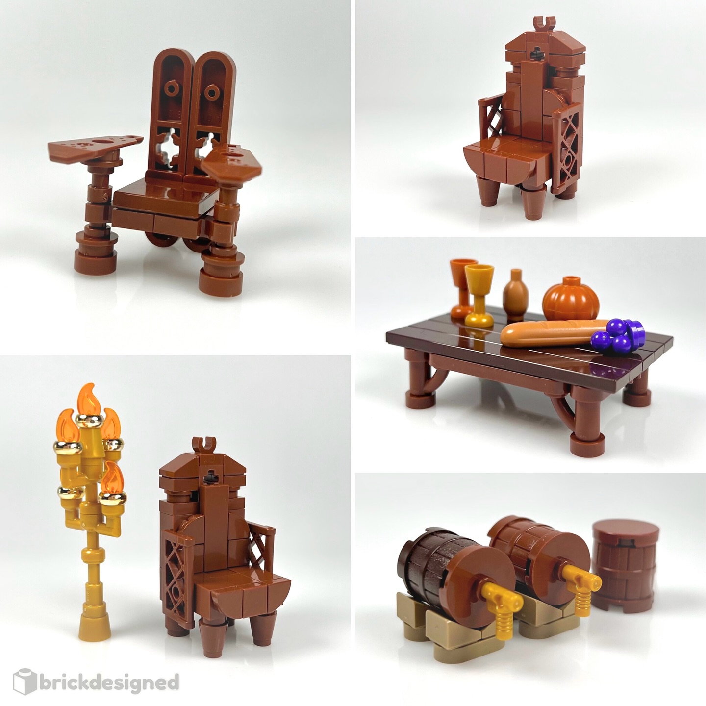
Something I want to highlight: Ground-Based style goes beyond just displaying elements. As previously explained, the MOC should represent a part of a world or a scene. Builds like furniture collections or figbarf displays, which only showcase individual elements, don’t fit this style because they lack context.
For instance, I wouldn’t classify Gus‘ minifigures, as fantastic as they are, as a Ground-Based display, as there is nothing in the scene but figures in a void.

Similarly, these pieces of furniture from brickdesigned don’t evoke a home because they remain self-contained.
Either of these examples could become Ground-Based with additional context in presentation. For example, see how Jan, the Creator’s MOC has the perfect amount of elements to invite the viewer to imagine the rest and the story behind the lounging minfig.

Similarly, Oshi’s build creates a believable interior setting that suggests a larger room and environment, even if all we see is furniture.

Still life and microscale
The magic of Ground-Based style is the viewer’s ability to imagine an extension of the brick-built reality beyond an image’s borders. For that reason, I would exclude larger scale MOCs, such as still life.
In my MOC below, despite having elements scattered on the ground, it doesn’t fit the Ground-Based style due to its scale. While the subject is built from LEGO, one can’t readily extrapolate a bigger stylized world.

Not every still life should be excluded, however. This MOC, built at minifigure scale, aligns better with the style.

The same principle of scale applies in reverse to microscale MOCs such as this on below by Klaas De Wit. Cheese slopes suggest an ocean, but the scale is too abstracted to easily imagine a full world off screen.

Minifigure-scale without Minifigures
Note that minifigures aren’t a requirement for the Ground-Based style – you can create a great scene without them. In this MOC, only a few leaves and wildlife are needed to evoke a vast jungle.

And in this artist’s studio from Jonah Schultz, everyday objects arranged in familiar patterns trick the mind into seeing the full room. Each of these MOCs showcase how the style can be effectively executed without minifigures when context and scale are relatable.

Composition
Composition is a crucial aspect of MOC building, as much as photography or building, greatly improving the overall look of a MOC. It’s a skill that develops over time and is highly subjective. Some people will love the composition of a MOC while others won’t.
As said, composition is rather subjective, creating a complete tutorial that fits everyone’s can be challenging. However, I’ll still try to give you a few composition tips related to the Ground-based style of course.
Below, I’ve put together a concise tutorial to show how well-thought-out placement of elements can significantly improve composition.
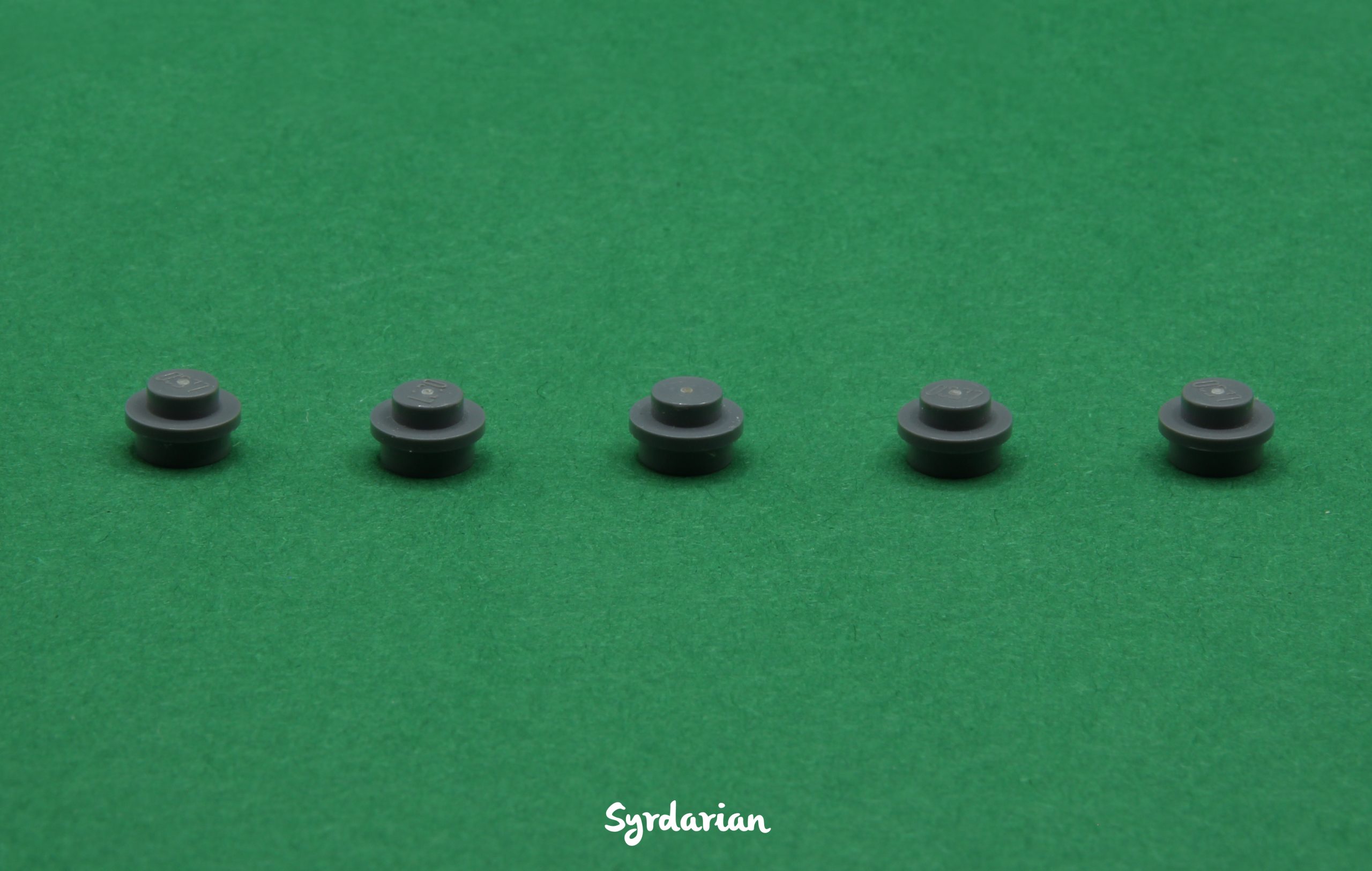
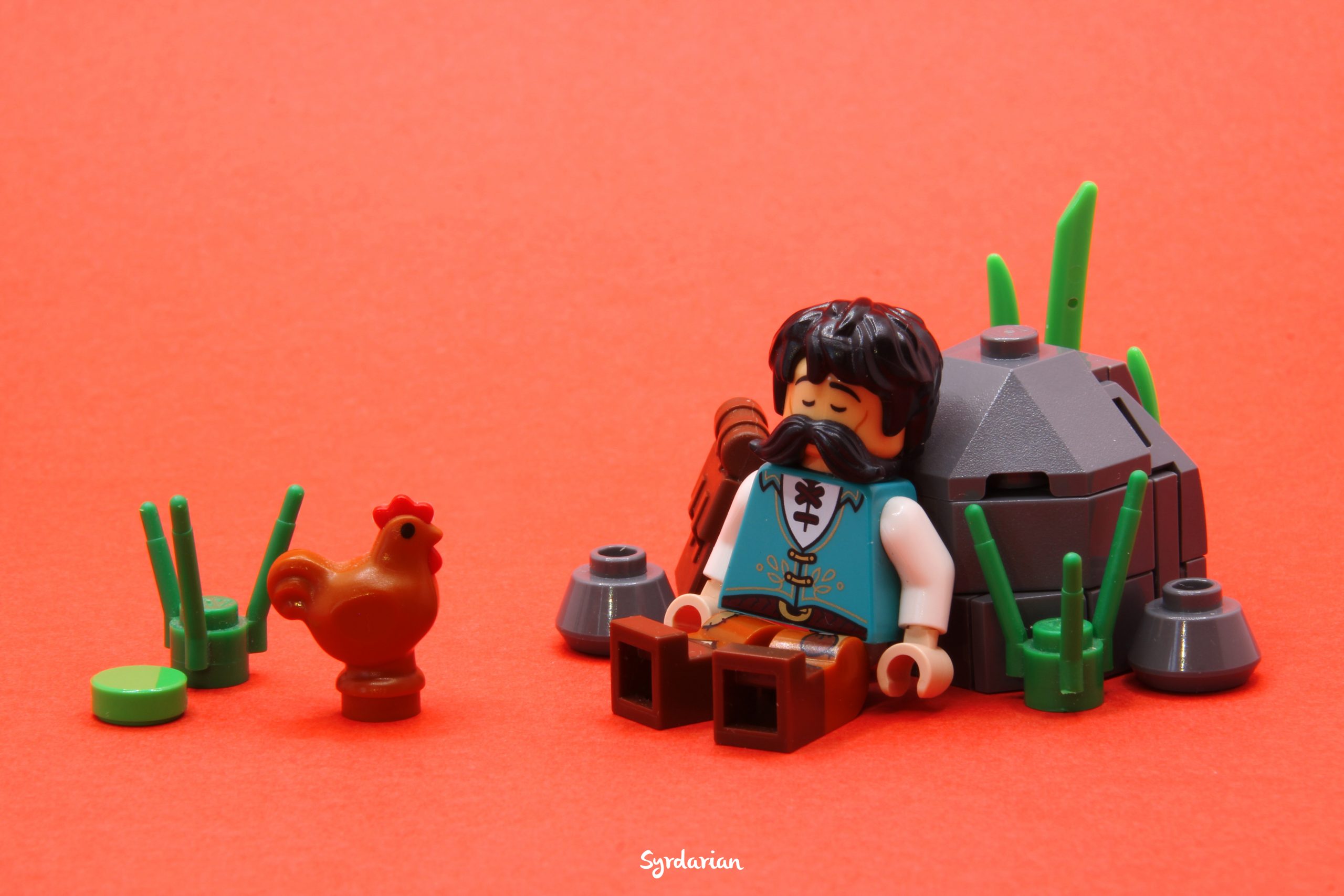
Let’s break down the picture above. Even if it’s extremely simple, there are a few tweaks we can make to enhance the overall composition. Five identical elements are aligned in a periodic pattern which makes the whole thing symmetrical. The experienced world is seldom symmetrical, so, to feel immersive, a few things need to be adjusted:
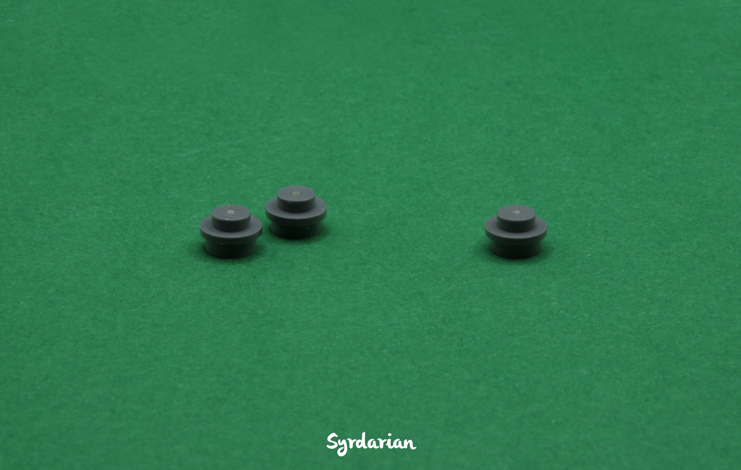
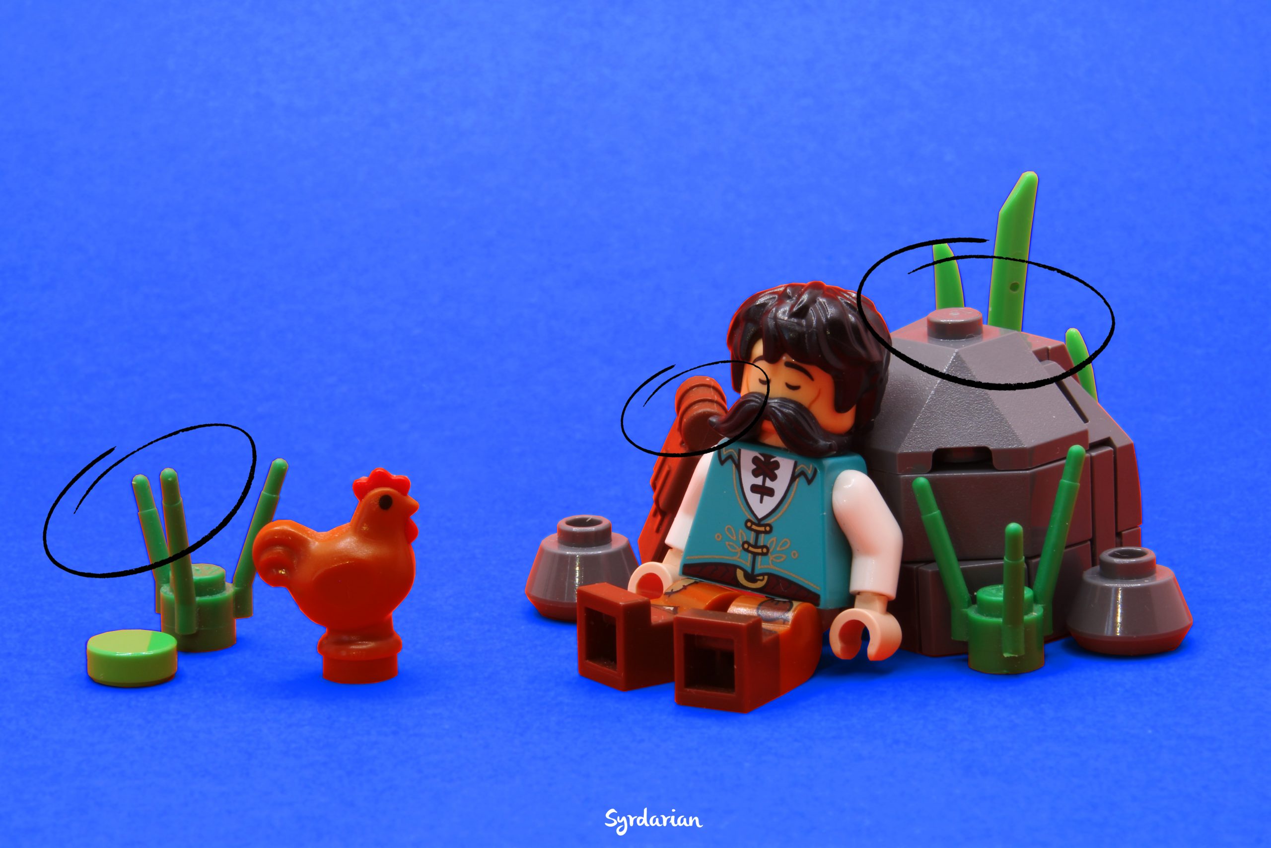
As you can see, I’ve reduced the number of identical elements from 5 to 3, as 5 seemed excessive. To break the symmetry and periodicity, I’ve grouped two elements together and left a gap between the third one. This adjustment significantly improves the composition but, there’s still room for improvement:
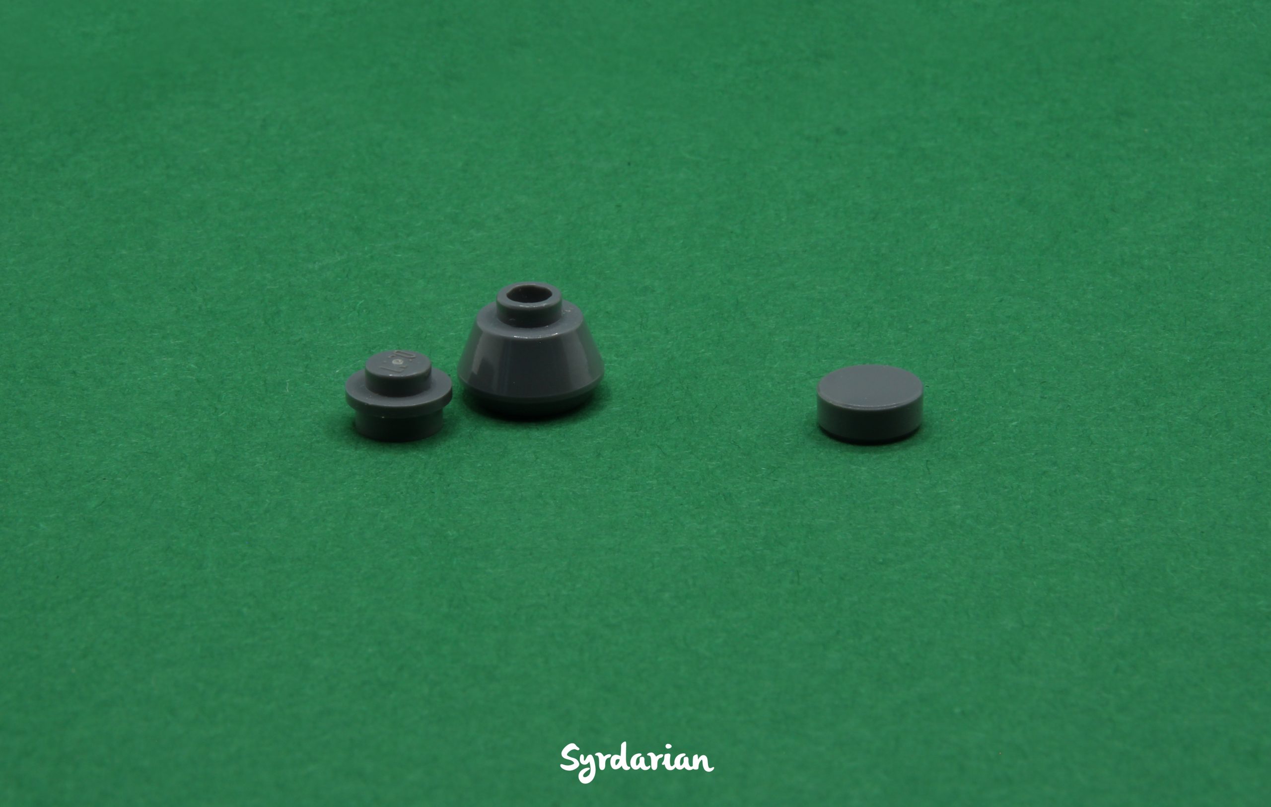
Another way to add variation is to play with the size of the elements such as here where I’ve replaced a small rock with a larger one. Alternatively, for the same sized elements, you can vary different parts, like here by using a round tile instead of a round plate. By reducing the amount of the same element, varying element sizes and shapes, and breaking up symmetry and periodicity, you can improve the overall composition and better sell the illusion of reality that is key to Ground-Based MOCs.
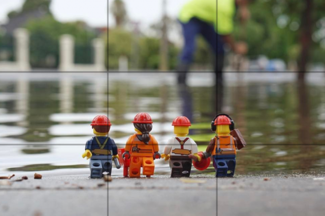
The rule of thirds from photography is another tool that can be applied to MOCs. By dividing the frame into thirds both horizontally and vertically, it creates nine equal parts with four intersection points. Placing elements along these lines or at the intersections can create a more balanced and visually appealing composition. As I haven’t properly used this technique, I won’t go into detail on this subject, but for those interested in learning more, check out this article on BrickPixel.
Color
Choosing the right color for a MOC can be challenging, and Ground-based builds are no exception. Color is perhaps even more important because so much of the world is made up by what you don’t see. I won’t dive into all the complexities of color theory, as it’s a vast and well-covered topic, even within the LEGO community. Moreover, as I haven’t done any art studies, I would be in no position to claim authority on this topic. That said, in my “Lego career,” I’ve learnt a few tricks that might be useful.
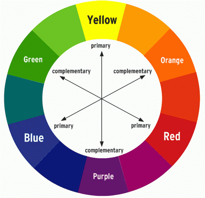
If you feel lost on which combination of colors to choose, the color wheel can be a great resource. Complementary colors, in particular, tend to create striking combinations.
You don’t want to overwhelm the MOC with countless colors, so I recommend sticking to only a few tones. Here are some examples of palettes:
- (Reddish brown, Brown, Dark brown)
- (Light bluish gray, Light gray, Dark bluish gray, Dark gray)
- (Dark red, Red, Reddish orange, Orange, Dark orange)
Each color in these palettes is relatively similar to the others, which prevents overcrowding the MOC with too many colors. You can find pre-made color palettes – made with LEGO color or not – on platforms such as Pinterest or Coolors.
Chris Clarke wrote an excellent piece on the LEGO color palette for Brick Nerd.
There’s no need to stick strictly to the chosen palettes for every single element. Adding a few minor elements in contrasting colors can actually enhance the design. As long as these elements are used with partimony, they can add visual interest without encroaching the MOC. Think of a few red flowers on a green plain/forest: they pop from the rest, breaking the monotony and adding depth and visual appeal.
Installation
Assembling your disparate elements into a unified ground-based MOC is more complicated and labor-intensive than typical MOCs as loose parts are prone to falling or being knocked out of that carefully composed arrangement, which can be quite frustrating for the builder. To make the process smoother, consider the following tips:
- Sticky Paste: Although some people might view it as a last resort, it’s actually very handy. I use it occasionally, while installing, for elements that tend to fall but that would normally be held in place by gravity.
- Stable base: Highly recommended, especially if you don’t want to use sticky paste. Trust me, it’s a nightmare when adding a part causes all the others to fall because your table wobbles or paper rustles.
- Big elements first: Especially when working with a lightbox, where space is limited. You don’t want all the smaller elements to fall when you’re trying to squeeze in the biggest components.
Background
For a plain background, colored paper is the way to go. It’s cheap, easy to find and set up.
I recommend using A3 paper over A4, as it minimizes the need to edit the seam. If you’re stuck with A4, it’s not a major issue, the edit is manageable. When it comes to paper texture, a subtle, natural texture works best. Avoid paper that’s too plain or too patterned, as it can look uninteresting or distracting, respectively.
Choosing the right background color for your MOC can be quite challenging. As with composition, it’s hard to put into words – it often comes down to intuition, but don’t worry, it’s something that develops with time and experience. Ultimately, it depends on your MOC and the effect you’re aiming to achieve. Although I feel I’m far from being an expert, I’ll try to provide some examples to illustrate the point.
A background can be a way to integrate a MOC into an environment. By choosing a color that’s close to the average color of your MOC, you can create a seamless transition between the two and sort of an extension. For instance, a green color can be used to represent a forest, which is exactly what I’ve done here.

Similarly, in the following MOC, by using a background of similar color to the brick yellow temple, the model appears to blend naturally into the desert surroundings:

A background can be used to create contrast, which can look great – but be careful, as it can also distract from the MOC. Since the MOC should be the main focus, finding the right balance is key and, in my opinion, tricky to achieve. In the following MOC, the yellow background contrasts too sharply with the rest, throwing off the balance:

To keep the focus on the MOC, a less flashy and saturated background color tends to work better, just like gray in the picture below. Although a dark red background would have complemented the netherrack, I opted against it to ensure the red in the MOC remained the main focal point:

Since those types of MOC are usually packed with loads of details scattered around, having a non-plain background – such as pictures of mountains or forests – is not a great idea in my opinion as it can make it hard to distinguish the MOC from the background due to all the competing details.
That being said, I think subtle elements such as clouds, birds in the sky, or a landscape silhouette could work well without impacting the overall composition too much.
Changing Color in Post
One thing to know: you can adjust the background color during post-processing. Usually a lifesaver if you discover that the color you chose doesn’t work well with your MOC.
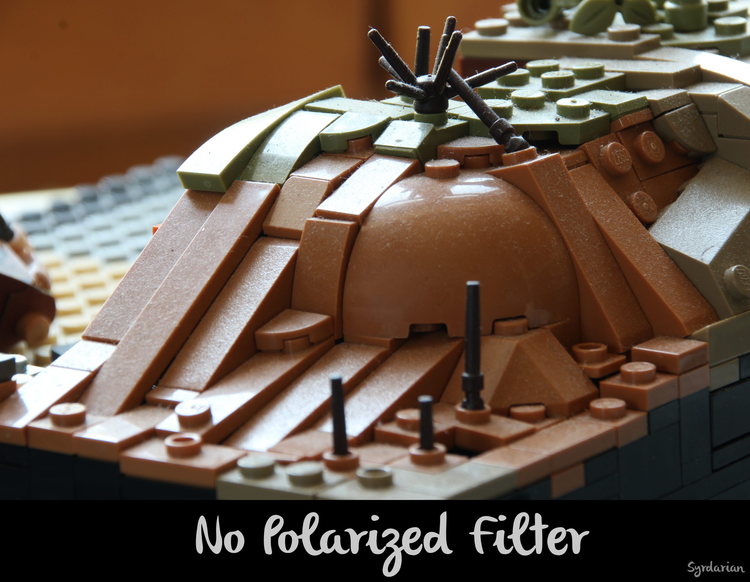
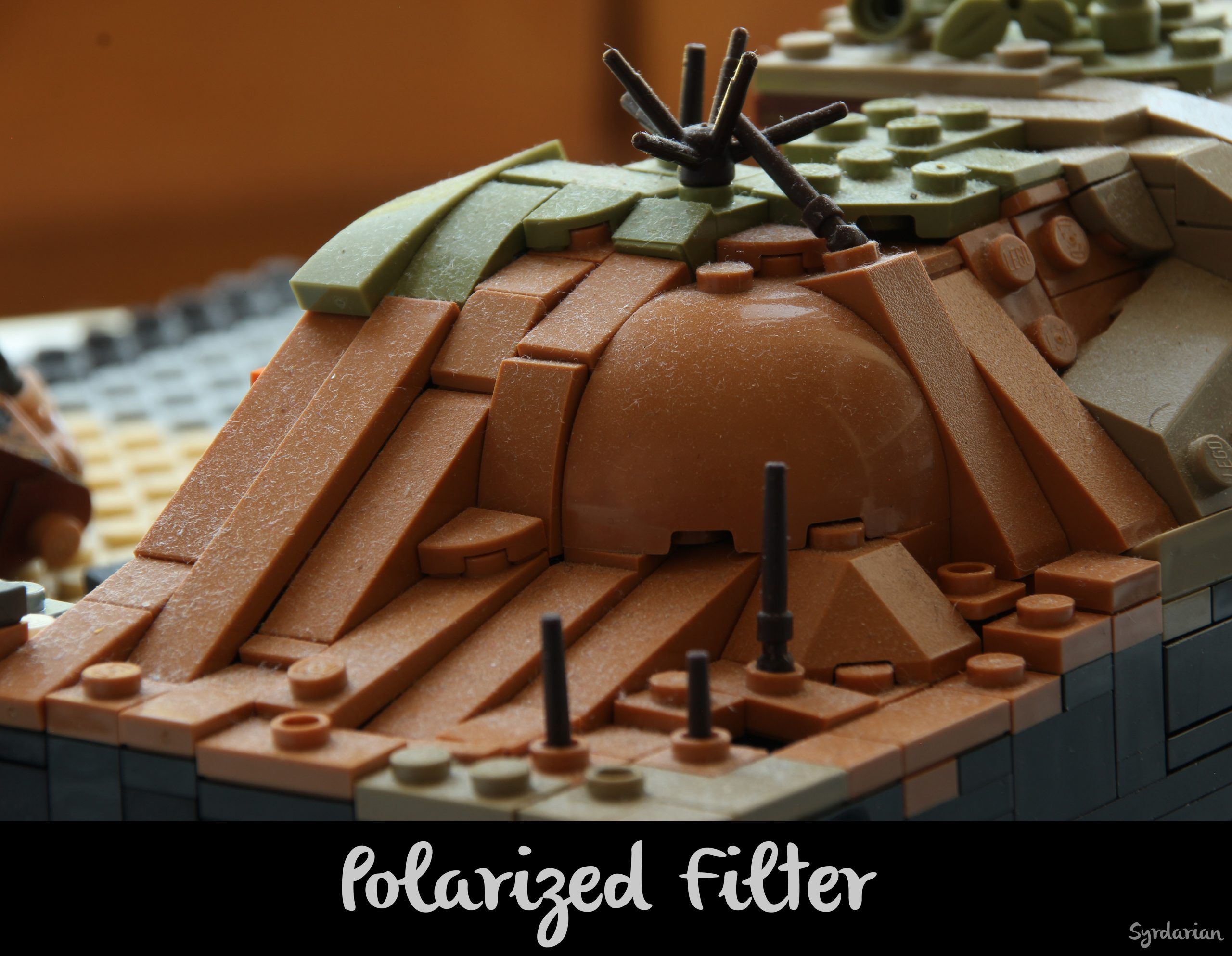
If that’s your plan, be careful with reflections. Bright colored paper will inevitably produce bright reflections on the bricks, especially without a polarizing filter (I’ll talk about that later). These reflections will be even more noticeable if you change the background to a darker color, and fixing them in post-production will be time-consuming. For example, if you’re working with a vibrant background, such as red, your MOC might take on a reddish glow that is imperceptible with the red background…
But if you change the background too to blue in post-prod, the red reflections on the bricks will still be very visible, which can feel very unnatural. I don’t recommend this approach.
If you’re unsure about the final color, consider using a more muted tone, as the reflection will be less noticeable. In cases where you do end up with flashy reflections, desaturating them in post can be a viable solution.
Other surfaces
Obviously, nothing is stopping you from using the surface you want and we didn’t have to tell certain people in the community twice. Indeed, we’ve seen a lot of creative ways to use other surfaces and I love discovering others. Special mention goes to Typical_builds, who has used unique surfaces like a round slice of wood…

or even just a wood tabletop

You can really go crazy with the object/surface, such as Tomasz Bartoszek in his MOC below where he uses some kind of a wooden lid.

I highly encourage you to experiment, as it can lead to fantastic results. Personally, I’m planning to use roof slate. It could look great.
Shooting your Ground-Based MOC
Camera and tripod
Obviously, a camera is a must-have. Others get good results from just a smart phone, but I’m not familiar with that. I prefer a dedicated camera. No need for an expensive model: With a bit of creativity, amazing photos can be taken with minimal equipment. A tripod is also strongly advised, if not essential, for achieving clear images.
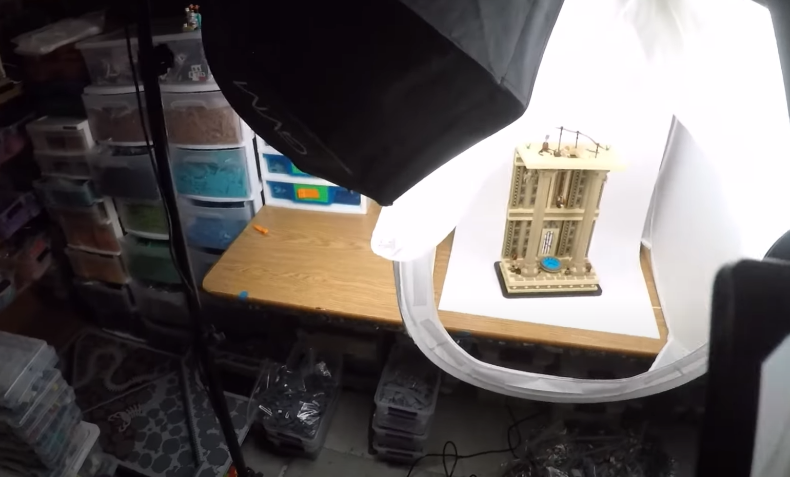
Lightbox
For clean and evenly lit photos, a lightbox is a convenient and affordable solution. However, you can definitely achieve similar results without one by using a few lights and diffusion (more on that later). I’ve been in the same boat – I only recently invested in a lightbox, and prior to that, I managed to get comparable shots, it just took a bit more effort and experimentation.
Manage Blurriness and Dust
For close-up, dust is often highly visible. To keep your photos dust-free, try shooting your MOC just after you have finished it. Alternatively, use a soft brush or remove it with editing (though this can be tedious and time consuming).
As you can see on the picture below, dust is very noticeable.
To avoid blurry photos, a tripod is essential to eliminate camera shake, paired with a self-timer and careful exposure settings. I’ll dive deeper into camera settings in the next section to show you how those are key to achieve high-quality images.
In order to reduce reflections on the bricks, consider investing in a polarizing filter. While it’s a more advanced tool that can significantly enhance your photos, it’s not a requirement, and you can still take great pictures without one.
Camera Settings
Let’s now turn our attention to the 3 camera parameters, the exposition, the aperture and the ISO.
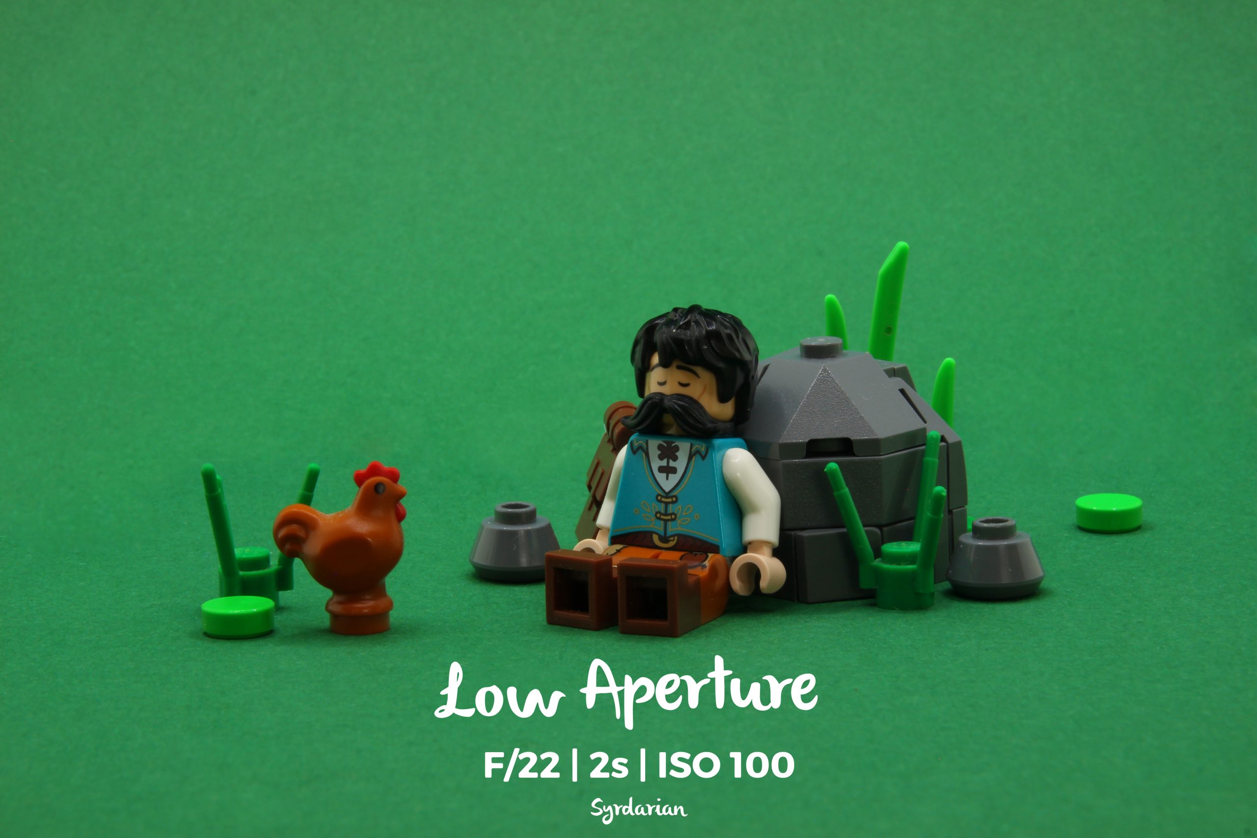
Exposure will depend on the aperture and ISO you choose, as well as the amount of light around your MOC. The higher the exposure, the greater the risk of camera shaking is, making your picture blur.
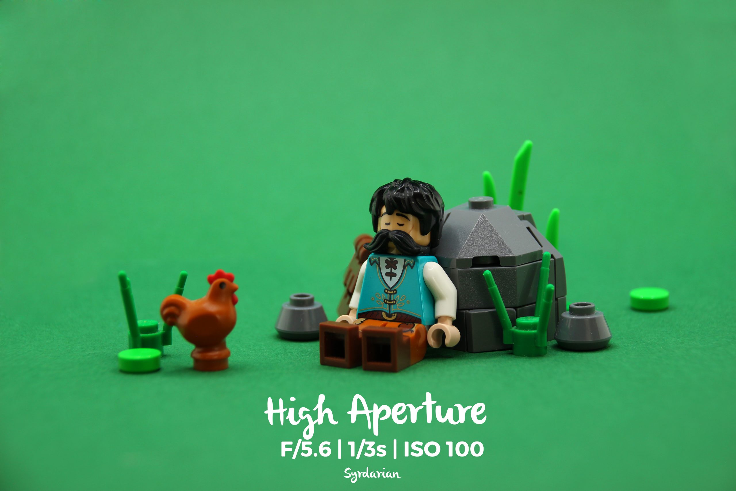
Aperture is very important as it controls the depth of field, determining what’s in focus. A low aperture value (higher f-stop) means more of the image is in focus, while a high aperture value (lower f-stop) creates a shallower depth of field, blurring the background and surroundings.
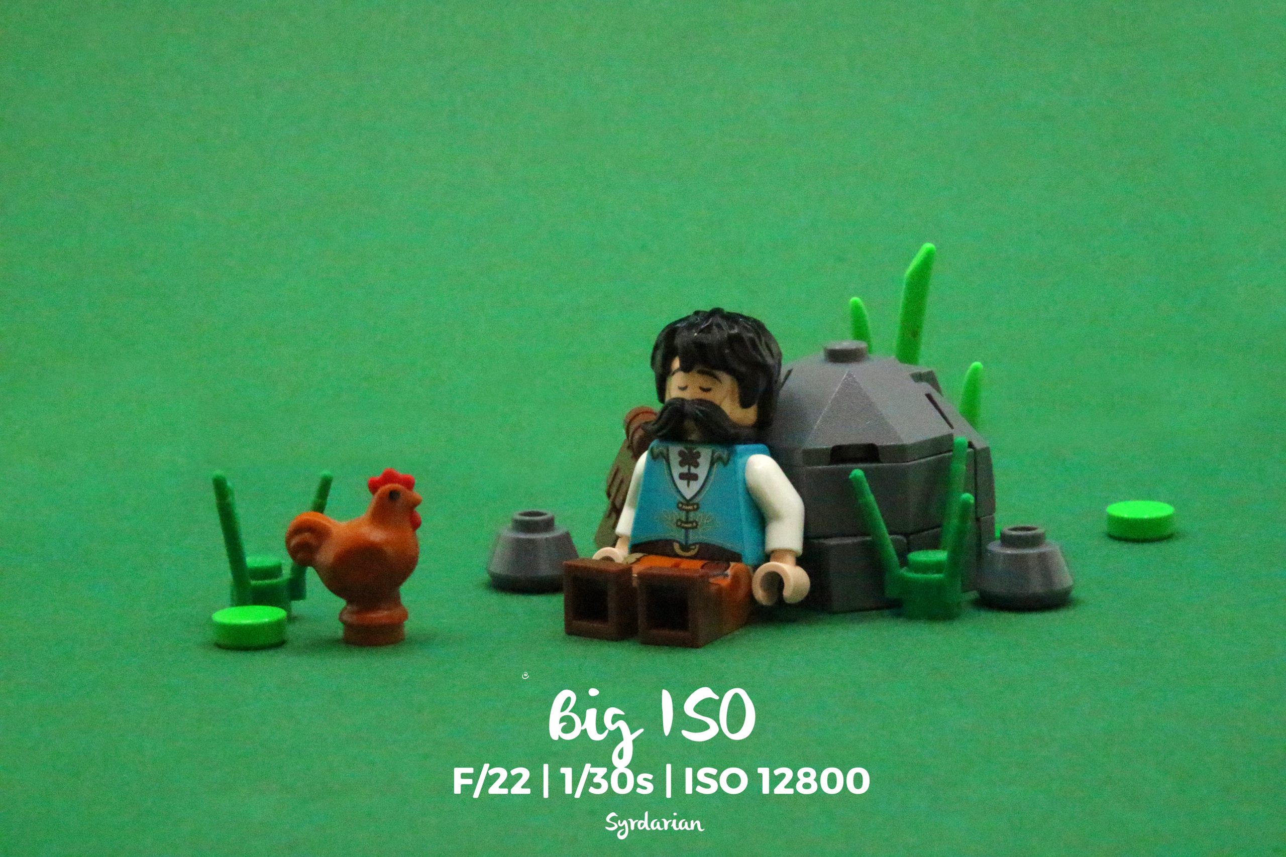
You always need to keep the ISO as low as possible to minimize noise.
Having a high aperture value can be an artistic choice: by blurring the background, it helps focus attention on the foreground while still maintaining visual appeal in the background.
Diffusion
In addition to a light box, I recommend placing a light in front of the MOC. Since the front is the most visible part in a photo, having it backlit often isn’t ideal. (See image below) This light should be diffused to avoid casting shadows. In order to achieve diffused lighting, you can either purchase specialized lights with built-in diffusers (like a softbox or umbrella) or create your own DIY solution by placing a white fabric or paper in front of the light source. A smartphone flash is also an option. To get for information on diffusion techniques, check out Forlorn Empire’s video.
Alternatively, cast shadows can be used to your advantage. They can be used to replicate the sun, moon, or any strong light source. For example, in the following picture, JakobKaiserMOCs uses an LED panel – but I guess the sun would work – to mimic the effect of dawn, which works very well. This is a great way to add interest and ambiance to a MOC.

Conclusion
In conclusion, I find the Ground-based style to be a truly unique and captivating approach that I greatly enjoy. Despite requiring minimal parts, it demands work of composition, installation and background, making it a challenging yet rewarding process. With photography as the primary goal, no need to build the back – it’s all about getting the perfect shot. I hope I’ve sparked your interest in this style, and I encourage you to give it a try – who knows, you might discover a new passion!
Extremely clear and interesting guide [thumbs up!]