 I recently came across a quote by Ace Kim, the admin of FBTB, who said “a good picture of a terrible model will look better and be more appealing than a terrible picture of a good model.”
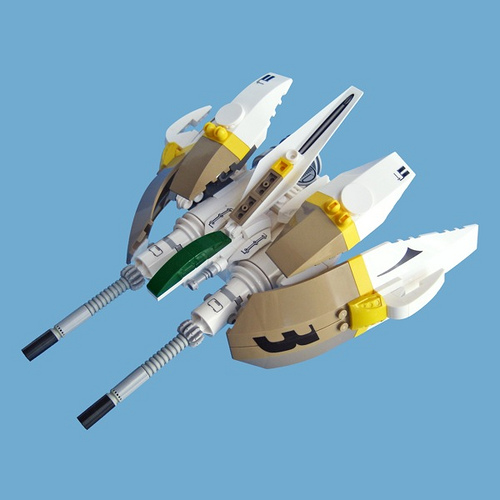
To a degree this is very true, which brings us to this interview with Fredo Houben (Fredoichi), a LEGO builder and graphic designer from the Netherlands. Granted, his models aren’t terrible — in fact they’re actually amazing.
What contributes to our enjoyment of Fredo’s creations is not simply the way he puts his bricks together but also his flawless presentation. As a bonus in this interview, Fredo goes through the steps he uses to edit a mediocre photo into a polished image.
The Brothers Brick: What do you like to build and where do you get your ideas and inspirations?
 Fredo: Well, I mostly build in the sci-fi theme. Think of starfighters, multiped walkers/mecha and near-future vehicles. Occasionally I step out of that realm and do something else with the brick, but it’s sci-fi that I enjoy the most.
I find it fun and interesting to vary and play with scale, though I don’t make the biggest things out there.
I really like the challenge of building in a smaller scale. As for ideas and inspirations, I have a lot of interest in the design aspects of things like video games, movies, animation and Japanese toys, and that’s basically what gets things going.
TBB: When did you enter the online LEGO community and have you had a dark age? If so, how did you rediscover LEGO?
 Fredo: I uploaded my first MOC on Flickr in 2008, since then LEGO is part of my life again. I say again because I stopped playing/building when I was 12 years old. I’m 36 now, so yeah I’ve had quite a dark age. Back then I played with LEGO day in and day out ever since I was 4. I had quite a collection by the time I was 12, but I lost interest in it and other interests took over like my Amiga, music and games. I felt pretty bad about it because I really enjoyed building, so I tried to come back to it a couple of times, but it didn’t feel the same anymore so I moved on.
Fast forward 23 years later, I all of a sudden felt the urge to do something with LEGO again. I work as a visual designer and I love toys and was thinking how I could create my own models and toys. Just do something else instead of design and 3D on screen… LEGO seemed perfect. I got extra motivated when I stumbled on some amazing work from a couple of builders on Flickr. Seeing stuff from Soren Roberts, Peter Reid, nnenn and Adrian Florea really gave me a good look of what you can do with the brick. These guys use parts in such a creative and different way and all have their own visual style. I had a lot of ideas, so I got my old collection from my parent’s attic and bought some new sets and just started.
More of our interview with Fredo after the jump:
TBB: Which aspects of building matter most to you?
 Fredo: That’s a tough one. I must say I’m all for aesthetics and design, but to get that aspect right you also need to have some techniques in building. You can’t really do one without the other, I think. Not that I’ve got down all the nifty techniques out there, but you must have some out of the box thinking to make certain connections.
Other things I enjoy when building are color and part usage. You know, squeezing in that certain part in a creative way always gives me joy, only if it helps the model of course. It’s something I enjoy from other builders too. In the end I try to make my builds look believable, right down to all the details in form and function, no matter what theme or scale.
TBB: What do you do to make your pictures look so clean and professional?
Fredo: To be honest, I don’t spend too much time on photography and I don’t use a fancy setup for taking pictures really. A sheet of paper and some decent global (day)light will do. So it all comes down to editing, which I enjoy very much and gives me better control and faster results on how I want my pictures. I’m quite quick and handy with Photoshop since it’s my everyday tool, so it doesn’t take me more than 10 minutes to finish an image.
Since I get this question quite often, here’s a quick breakdown of my editing routine, which is very basic, but maybe handy for those who don’t use Photoshop that much. If you haven’t got a version of Photoshop I’m pretty sure it almost works the same in other image editors out there.
A couple of simple and obvious pointers up front:
- Determine your background color in advance. Just try out some different sheets of colored paper to see how colors work and relate to your MOC.
- You always want contrast between the MOC and the background. So, never shoot a white MOC on white!
- NO FLASH when shooting pictures! You know who you are…
- When editing, keep your MOC next to you. It’s the best reference you have.
As you can see in the original picture, it really needs a bit of work. Now, I shot this one in a less than ideal light situation on purpose just to exaggerate and to show what you can do with not so great pictures.
Step 1. Lift it up.

First, crank up the levels a bit in terms of brightness, contrast and color. You can do this by adjusting the Curves. Duplicate the layer in the ‘Layer’ menu and then go to ‘Image’ in the top menu, then choose ‘Adjustments’ > ‘Curves.’
When doing this keep a good eye on your model in the image, you don’t want it to be too light, it really depends on what you’re working with. In this case you still want to see some details and have some contrast in the white. If you’ve never done this before, just play with it and pull the curves to extremes to get a sense of what it does. You can always go to its default and do it again.
Step 2. Take out that background.

Add a new layer in the Layer menu and drag it under the layer with the MOC you’ve just adjusted. With the Color Picker from the Tools menu pick a shade from the background in the image. Now go to Edit in the top menu and Fill the new layer with the color you picked… in this case I used a light blue. This will be the new solid background when you erase the background in the image. You can always change the color later on or use a picture as a backdrop instead.
Go back to the top layer with the MOC, then click on the Magic wand tool in the Tools menu. This is a tool you want to learn to work with. Just start with its default Tolerance settings. You may want to adjust that as you go along. To select all the pixels in a background like this, you need to do multiple clicks. Do this by clicking on several spots while holding Shift until the whole background is selected. Here’s why you want to have that contrast between model and background. The more the model stands out from the back, the easier this is. Take a good look and make sure the selection is around the MOC. You can also press Q to view the image in “Quick mask mode” and get a good view of your selection.
There are two things you can do now. You can take out the back by pressing delete or backspace or you can brush out the back with the Eraser brush from the Tools. In this case backspace will do since the MOC is “floating”. When you have a MOC that is standing on ground level and has shadows to deal with, use the eraser to brush out the back and brush the shadows until they blend with the solid color layer. Now your MOC is free in its Layer, with a solid colored background in a separate layer.
Step 3. Get rid of those glares and Adjust colors

If there are some really annoying shiny spots on your model, there are two very quick and easy ways to do this. Use the Clone stamp for smaller spots. For the bigger spots I use the the Polygonal lasso. Select a nearby spot on the model that has the right color and copy that in a new layer over the glare. It’s like a patch. Make the spot fit in it’s place by scaling it and blending it with eraser brush and selection tools and adjust a bit in color if necessary… works like a charm.
If needed, add some contrast and detail on the dark and light parts. Do this with Adjustments > Shadow/Highlight. This is another good adjustment tool to learn by playing with the extremes. Always try to keep things crisp in contrast and color.
Also try playing with the hue and saturation on separate colors. (Image > Adjustments > Hue/Saturation) Be careful with this, just use this for slight color toning or to give things a little more accent.
TBB: To what extent is your profession as a graphic designer/art director reflected in your creations?
Fredo: Of course the whole building thing is different from what I do for my clients, but I do take a designer’s approach when I make stuff. You see, it’s not that different — I sketch, block, build and tweak until I think it’s right, ready and presentable. I love creating visually interesting things and I’m very picky and serious about that. With that I think I’ve managed to find a style that I’m comfortable with and has become somewhat recognizable.

TBB: What future plans or projects do you have in mind?
Fredo: I must sort my collection; that’s for sure, but I rather build when I have the time. I’m also a working on a project where I’m combining my design work and building. I hope to announce that soon.
Darn. I was secretly hoping that Fredo would share exploded views of his awesome microscale starfighters! Still, this is good info to have as well. :)
‘original picture’ link (step_1.jpg) is a 404…
^ Oops. Looks like we missed rehosting one of Fredo’s pictures. It’s not a 404 anymore, but it shouldn’t be going to his server. I’ll fix it when I’m back home tonight (don’t have access to the server at work).
Great tutorial, even though I know PShop, I can always use a refresher.
My question is: how would he go about shooting a LARGE MOC? I’m talking like 4×6 Baseplates, or a good hefty SHIP? THOSE are the MOCs that give me a hard time…
Good article. Like Wunztwice, I already use PS on my models, but it’s always good to see a slightly different take on editing than what I do.
Man, there’s some good info in here. Thanks for the interview, BB and Fredo.
Great article! I use Photoshop for my models too, but there are some handy tips in here!
Holy crap!
I was just looking at his stuff on Flickr!
Anyhow, thanks for the pointers, even if I can’t quite figure out how to use them all in Gimp.
^ The language is all the same except for the magic, which is the free select tool in GIMP 2.6. Just familiarize yourself with some terms on GIMP.org.
This is a great article. I always have been intrigued by Fredo’s presentation style.
To correct my last post its the Fuzzy Select tool that is the same as the Magic Wand.
I’m really digging these interviews. It’s great to hear about people coming out of their dark age, even if it was so long ago. Good tips too!