The World Map mosaic released by the designers at LEGO was clearly a winner with the constant hits to our servers on our review of the set. Having said that there was quite a bit of chatter in the forums on the decision to go with a white continent while the oceans had topography details. What if it was reversed with a bit of creativity thrown in? Lysander’s Stud Studio took that very step and depicted the national flags of the country as best as possible and leaving the wide oceans a consistent blue.
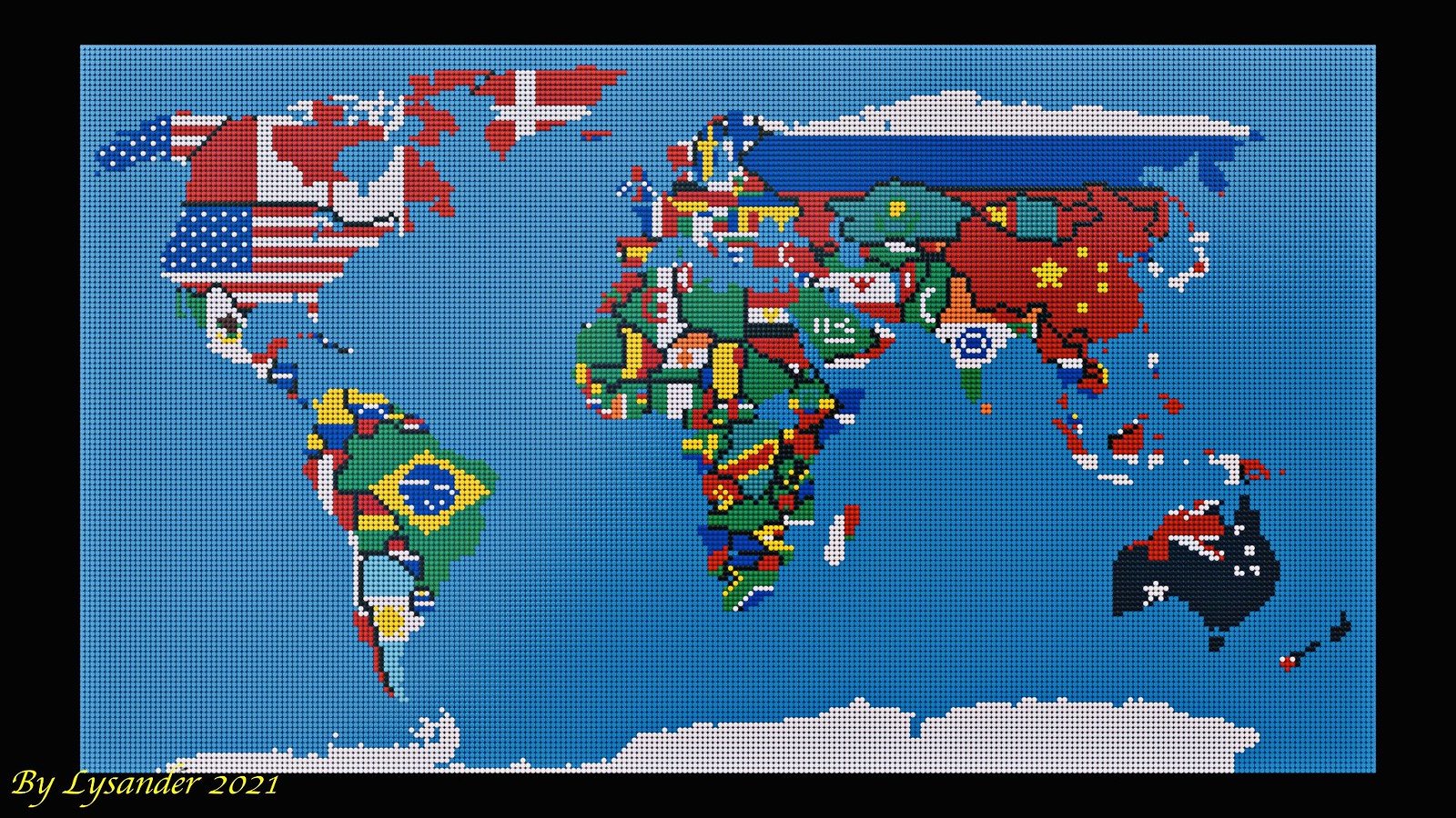

I personally think there isn’t a right or wrong answer, but it all depends on your preferences and perspectives of what appeals to you.

The idea of a World Map isn’t new and has been attempted at a similar scale by dirkb86 (dirksbricks) back in 1997.


Dirk’s choice of design not only depicted depth by colour but also via physical elevation for both the ocean and land masses giving it a nice textured look.


You can build what you fancy, as long as you have all the bricks on hand, which can be expensive to source in quantity. This other design by Reddit user GooseWithDaGibus is built with more earthly tones.


Builds of world maps is not a new idea and I’m sure we’ve seen many of these along the years and variations from creative builders out there and among those are is LEGO’s own map design found on their corporate pages which have a more playful tone.

If you’re ever in a LEGO office, I’m pretty sure you can spot a world map splashed on the wall somewhere if you’re lucky enough. This particular photo was taken in the LEGO Singapore office located at South Beach Tower. Human being shown for scale.


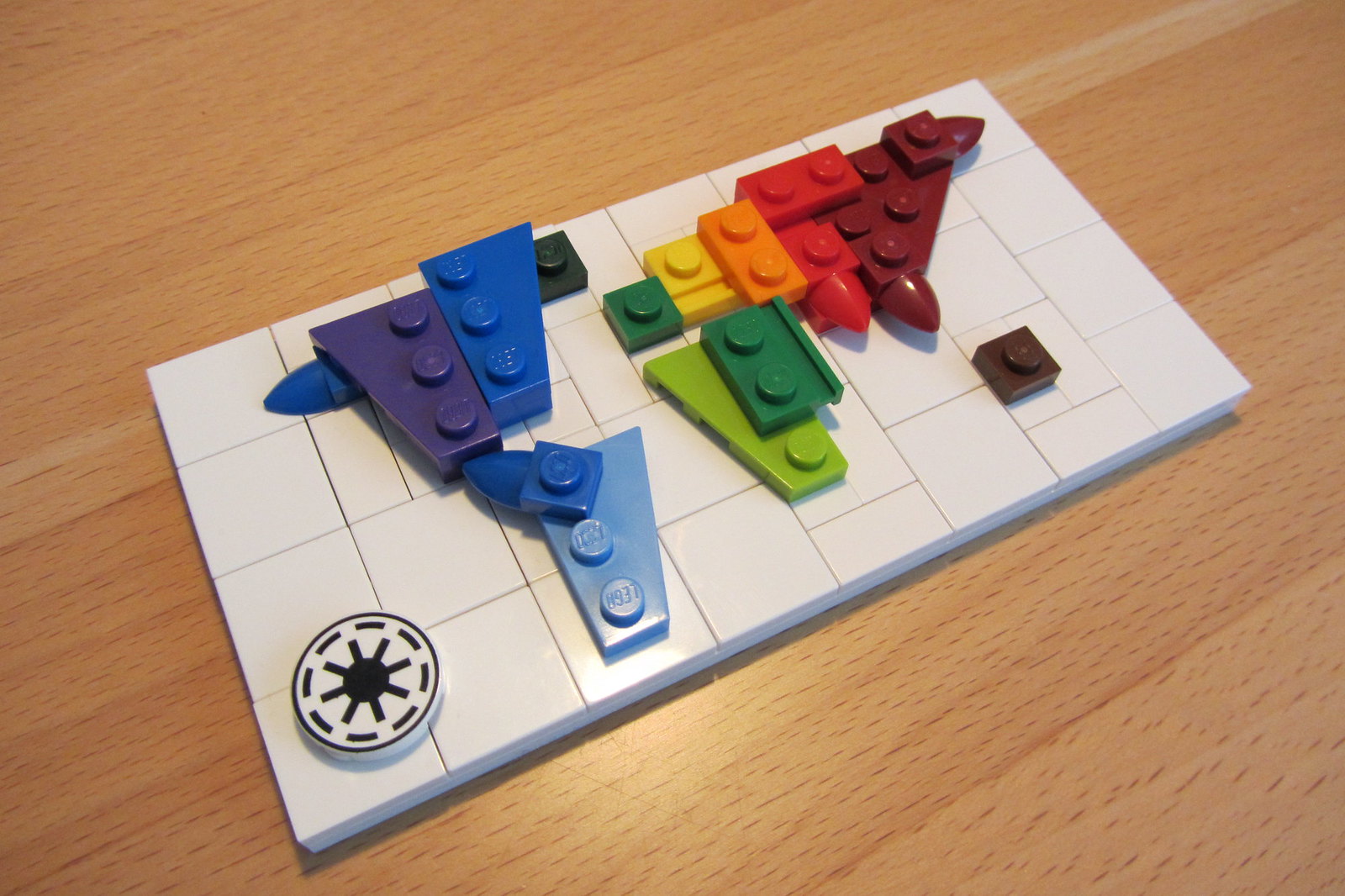
All things said, my favourite world map design is one that I can carry in my pocket which is another wonderful creation by dirkb86.