After a couple weekends of PHP and CSS coding, I’m pleased to announce the launch of the new look and feel for The Brothers Brick!

This new design has a brighter header graphic and more room for cool widgets to either side of our posts — like a scannable list of the most recent comments — along with smaller tweaks like better-organized categories and collapsible archives.
For those of you on the RSS feed, be sure to click through to see what you’re missing.
Troubleshooting
 We’ve tested our changes on Safari, Firefox, and Internet Explorer on both PC and Mac, but let us know if you have any issues.
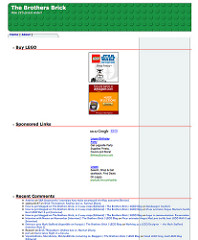
One of the most common issues appears when you load the new version of Brothers-Brick.com for the first time. You’ll know it when you see it (right).
Just clear your browser’s cache and it should appear normally.
First a code thing: The round corner boxes on the side bars and bottom bar can all be done with CSS, which is generally better.
On an individual article’s page, the side bars are ridiculously long. It would be nice if they appeared in a truncated form (say, only polls, about, archives, and meta, which should line up with the 10(?) most recent comments)
Maybe it’s time for some tabs across the top (ooh, maybe in the form of 1×2 plates attached to that baseplate!) in order to take some of the load off the front page. There’s a TON of information there, and maybe the ever growing lists of blogs and websites deserve tabs. Also with tabs, the sky is the limit for new features to the site.
Also, good job on recursive images :)
Great suggestions! I’ll definitely try to make some of those changes — nearly all fairly easy to do.
The rounded corners were certainly annoying to try code around, but I was working with our original theme as the baseline. Mind if I shoot you an e-mail to ask some technical questions?
well, great, you tested explorer, safari, and firefox, but what about the multitudes of users that use netscape navigator? hmmm?
One easy way to generate both the images and the CSS for rounded corners is at http://www.roundedcornr.com. It’s not the most efficient markup but it is very flexible. I used it as a basis for those at brickset.com.
I can’t help feeling the new design looks a bit cluttered and difficult to find the content among all the sidebars and adverts. I think I’d be inclined to drop the left column, move what’s in it to the right and put the lists in the right column on separate pages. They are getting a bit long and overwhelming.
The ‘recent comments’ list doesn’t really do a lot for me — the list needs some bullets or something and in the list I’m seeing there appears to be a user called ‘How to get blogged on The Brothers Brick, in 3 easy steps [Editorial] | The Brothers Brick | LEGO Blog ‘ commenting on a number of articles which I don’t think can be right. (e.g. How to get blogged on The Brothers Brick, in 3 easy steps [Editorial] | The Brothers Brick | LEGO Blog on Bandwagon mayhem).
I hate Google ads — perhaps they are coining it in for you but with the likes of ‘Furness Brick Traditional bricks and specials in all sizes, colours and textures ‘ being served to UK visitors, I doubt it. If I had to make one change only to the page layout it would be to remove the Google ads at the top of the page so the main headline and content is more prominent.
If I can be of further assistance, let me know, or feel free to ignore me :-)
huw@brickset.com
I must admit, I really don’t like the double sidebars. I realize that they haven’t made the main content any thinner, but they give the illusion of doing so, and it looks ugly.
The most recent web statistics show that Netscape Navigator’s usage share is now less than one percent, so testing for that particular browser would be counterproductive… Almost like testing whether the site were still viewable in 640×480 VGA resolution.
I agree with Kevoh’s suggestion for truncating the side bar for individual articles, or maybe moving the blogrolls and links to another page entirely. Other than that, the new layout is looking quite spiffy, and I’m eager to see what kind of cool widgets will be popping up in the sidebars.
Maybe it’s just personal but it all looks a bit cluttered up to me. On the old version it looked like we could breathe a bit more freely…? I prefer one sidebar (there was just one, right?)
This new design is very cool, but personally i don’t like very much the plate on the left.
The recent comments are not much usefull. May be you can move the two banner just below the search button and move the right plate on the left, so the ceter [the most importantp part of the page] can be bigger.
Anyway, these are my personal tought.
Great work, now we have the version 2.0 of Brick, BEFORE LEGO! 8))))
Hello,
I’m new here in posting comments, but not new in surfing the website.
I have to admit that I agree with the ones who think that the middle part should deserve more space and I’m not convinced at all by the double sidebar.
I personally don’t like the new look. As Eti said, it looks cluttered and makes my eye wander away from the content on the page. The rounded corners are good as usual, but maybe you should delete your HUGE BlogRoll in your right sidebar. The ads in the left sidebar are also distracting and sort of bring the overall appearance of your blog down. The recent comments is a good addition but generally looks just like a big chunk of text. You really need to add bullets or some kind of separator between each “recent comment”. Overall, the general idea of your blog is still there but lost in all the mess.
Nice change.. always good to see a site have a refresh from time to time.
Any chance of making the width slightly flexible for us on widescreens? :)
But I do agree that the sidepanels looks a bit goofy, going down 5 miles, when the actual page content is only a screenfull or so!
Maybe on the actual article pages (as opposed to the front page), things like the categories, and blog links could be condensed, or collapsed.. How about showing top ten blogs, or even randomly cycle the top 20, (so owners don’t feel left out!)
Also.. for fun.. you could let people change the ‘brickplate’ at the top to a favourite colour! or randomise it on each refresh! :)
btw.. loading nicely here on Google Chrome!
RB
Looks good. And thankfully, not too much has changed :) I really like how the search by category now shows the posts/images as a whole, so I don’t have to open them all to find the post I was looking for. Thanks for that.
Also, I think the caching problem might occur because of files being named the same as the old version. Rename you .css file and solve most of the problems, I think (I’m not experiencing any problems though).
@Kevoh: I agree with these nice tips. I love the tabs idea with the 1×2 plate! You could put the archives and about pages behind a button so save space and loading time on the homepage.
To my knowledge, ‘pure css’ corners can only be made in FF. You’re going to need some kind of images anyway, but it’ll probably generate less code and will make the pages load quicker (due to caching of the css). To the builders: have a looksy here: http://www.cssjuice.com/25-rounded-corners-techniques-with-css/
@dover: pffft! http://en.wikipedia.org/wiki/File:Netscape-navigator-usage-data.svg ;)
I’ll agree that the double sidebars give me a bit of claustrophobia. Especially when you get down below the text on the left. Title bar feels a little sparse. List of comments would be more readable if they were categorized. I still love ya!
Love the new look, TBB is more than just an archive of great MOCs, it’s also a hugely important link resource and this tidies things up nicely – I also love the fact that whole posts are now displayed in a category search.
Keep up the great work!
Dr. S.
At work now. Over here in IE the rounded corners in the comment boxes look nice. At home in FF, not so. The frame is interrupted at the height of the horizontal line.
Wasn’t the previous changeover to WordPress the 2.0?
HA …. Now with 220 pixels wider goodness
I don’t like having the news in the middle of the too columns, I feel smashed in. lol
Just wondering if posts have to be approved, or was mine deleted? I posted a message a couple of hours ago (first post from a long-time reader – just signed up!), and I thought I saw it appear here.. but now it’s gone!
RB
Mostly sensible stuff, but several people have brought up the sense of 2.0 being too crowded. I noticed the same thing initially, but for me that went away once I realized it was because the post itself is a picture of itself (and on and on), thus filling the entire top of the page with the same material causing a tad bit of overload. I give it time to see if the feeling lasts to later posts.
Thanks for all the great feedback so far, everyone! A couple quick points…
The main post area is actually 15-20 pixels wider than in the old design. I strongly suspect that the sense of crowding and clutter is at least in part an optical illusion caused by my silly recursive announcement graphic. :-P As a test, I’ll keep this design for a week, and then post a poll to see what you think then.
I hate the non-LEGO ads too, to be honest, which is why I removed them from the top of the main page. They do help pay the bills, but they’ve been dropping off enough recently to consider removing them entirely. We’ll see.
Keep the feedback coming, please — it’s important to know what you think. Thanks!
Might be unrelated to the new changes but I had to reset my password, the old one wasn’t working anymore. Just an FYI for anyone else experiencing the same problem, a new password will get you up and running again.
I don’t mind the changes, to be completely honest I didn’t notice it until after I read the article about it. It’s very subtle, it’s fine.
It should read “now 8 studs wider”
Looks fantastic to me! It puts a ton of great material and resources right on the first page, and I don’t personally mind having the two bars on either side.
Nice work!
It’s fine Andrew, within a week I’ll forget the old one. It’s not as ugly as some updated websites (Every Yahoo update) are. :)
I don’t quite see a need for the left column. The Buy Lego and Sponsored Links could go back to the right, IMO, and I do not think I’ll ever use the Recent Comments, though I don’t know about everyone else. This would then give more blogging room to make shorter pages.
But it’s not terrible. I’ll live and keep reading.
I’d make the right sidebar end after the content; as it is now everything past the first 1000 pixels or so only serves to make the user feel claustrophobic.
Thank you for all the hard work that you all do.
Although I am sure that I will get used to it I too am losing the main content in between the two side bars. I would recommend moving the left sidebar into the top of right sidebar and add some collapsing on the main sections for the right side.
I’m glad I’m not the only one Dean. I don’t even see the point of the left side bar, there is hardly anything in it and that stuff can just get added to the right bar.
Still the number 1 LEGO website through. :)
Okay, I’ve made a bunch of the easy changes you guys have suggested — particularly reducing the number of items in the sidebars except on the main page.
I’ve also added some stuff to the left side bar (my intent all along), hopefully making it somewhat less pointless. ;-)
So, one day in, with the brain-spinning recursive image off the top of the page, how are people feeling about the new design?
One thing I noticed is that some of the posts had all their body text in bold, same as the sub-headings. This made it quite difficult to read and feel very “text heavy” onscreen. However, I noticed the more recent posts didn’t have this, so I assume that was a formating error that’s been sorted. Just wanted to flag it just in case.
Overall, I think the new design is good. And I think regular readers like to see where the new comments are appearing.
When it comes down to it, TBB could look like total crap and it would still be the best resource on tiniterweb for finding cool Lego stuff…
The new flickr sidebar is a very nice addition. The Recent Comments part is even nicer. That’s something I actually missed before!
As a regular visitor I don’t need the Cateories sidebar and the huge blogroll all the time. Is there a way to fold them in/out like the Archives? Just a suggestion – it didn’t bother me before, so it wont bother me now.
Great work all around. And thanks again for all the effort you put into this, just to keep us addicts entertained :-)
That new Flickr pic sidebar is great! Maybe the left bar isn’t so bad after all…
Fashionably late the party due to technical difficulties. I like the new design I don’t mind the two columns on the home page – but the empty LHS column on the blog entry pages seems a little odd (unless it will eventually have content).
The Flickr photos thing is an excellent – it’s a pity other photo sharing sites don’t have the same feature (or do they?).
Louise